Visualisation depth, not component count.
A deliberate gallery from the catalogue of 100+ pre-configured components — the visualisation patterns that prove the application surface is more than a form library. Same data rendered six ways. Inline analytics inside grid rows. Configurable rendering for every data type. Color rules at the engine level. Dashboards and document generation built in. AI as production patterns, not lab demos.

Same data, six views
A virtual table renders the same source as Grid · Grid Transposed · List · Timeline · Analytical Card · Calendar — view-type is a property, not a separate component. The buyer who wants their data as a calendar gets a calendar; the buyer who wants it as a timeline gets a timeline; the metadata entry is unchanged.
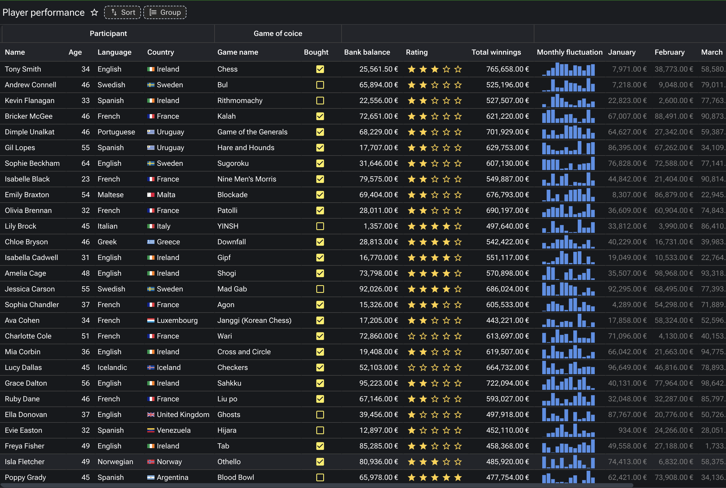
Inline analytics in grid rows
Grid columns can render as line, area, vbar, percent, progress, ball, distribution, pie, battery, rate, gauge or circle visualisations — mini-charts inside individual cells. The kind of analytical grid that takes weeks to build by hand, configured as a column property.
The render system for every data type
Numeric → readable (units, currency, bytes, time, duration), spinner, slider, rating, percentage. Date → date, time, datetime with precision and condition wiring. Select → select, choice, item-group with their full styling catalogue. Each data type carries its own render variants.
Two grid modes — backend-paginated and in-memory
The enterprise data grid runs in two modes. Backend-paginated for scrollable result sets at million-row scale: data fetched server-side, virtual-scrolled client-side, no DOM explosion. In-memory for analytical workloads: full dataset loaded once, with client-side filtering, grouping, sorting and inline analytical visualisations. One widget, two scale regimes.
The visualisation gallery
Eight patterns from the demo component catalogue — each one a discriminator against typical enterprise UI libraries.
1 · Same data, six view types
A virtual table accepts a view-type property. The same metadata entry, the same dataset, the same wiring — rendered as Grid (the default tabular view), Grid Transposed (rows become columns), List (vertically-stacked records with images, subtitles, badges), Timeline (chronological with date, icon, color, alignment variants), Analytical Card (KPI tiles with embedded charts) or Calendar (events on a month or week grid). The view-type switch is a configuration; the buyer chooses what fits the workflow.
2 · Inline analytics inside grid rows
The grid's row types include line, area, vbar, percent, progress, ball, mm, distribution, pie, battery, rate, gauge and circle — visualisations rendered inside individual cells. A profit column shows a line of monthly trend; an implementation-rate column shows a percentage bar; a ranking column shows top-25 distribution. The grid behaves like a dashboard while staying a grid. Configuration, not custom code.
3 · The render system per data type
Every column data type carries its own catalogue of rendering options. Numeric: readable formatting (units, currency, bytes, time, duration), spinner with min/max/step, slider with show-limits and show-value, rating with custom icons and half-step, percentage with min/max wiring. Date: date / time / datetime with precision, custom month format, conditional enable, related-field wiring. Select: select / choice / item-group with chips, icons, colors, dynamic SQL data, dynamic script data, info on hover, max-line truncation. Boolean: checkbox or switch with custom values, colors, labels, info expansion. The render is a property; the developer chooses without writing UI code.
4 · Color rules and conditional formatting at the engine
Cell color rules apply at the engine level — quartile distribution, ranking, repetition highlighting, gradient by value, group-based coloring, *Up Is* sentiment colouring. A revenue column heat-maps automatically by quartile. A KPI column colours green when the metric is improving and red when it is regressing. Excel-level conditional formatting, declared once on the column metadata, applied to every render of every grid that uses the column.
5 · Foreign-key intelligence
When a column is part of a foreign key, the metadata repository recognises the relationship. The editor wires an autocomplete with search-as-you-type, bound to the parent table; the platform handles the SQL, the caching, the keyboard navigation. Decorated mode adds PK condition, automatic mapping, search mapping, block messages on invalid references, enable-client expressions for context-sensitive lookups. Most ERPs hand-code FK behaviour per screen; here it is configured.
6 · Dashboards out of the box
Workspace dashboards, sales dashboards, operations dashboards in a Grafana style (home energy, infrastructure, website performance), banking dashboards, regulated-format financial reports (German income statement). Drill-down via link or via subscription — click a number and the underlying records or the upstream cause is one click away. Dashboards are part of the platform, not a bolted-on BI tool. The data layer, the visualisation layer and the security perimeter are the same.
7 · Document generation built in
PDF by design — author the layout in the platform; render against any dataset; output is pixel-perfect, matching regulatory expectations. PDF by template — a Word-style template with data merge points; the platform generates one document per row. Excel processing — read a template, insert data, write back. Real examples from the demo catalogue: a Big Data Analytics journal cover, a GLEIF balance sheet 2017, an invoice run, a multi-thousand-row data export. No separate reporting tool, no separate BI stack.
8 · AI as production patterns, not lab demos
RAG over the customer's vector store of choice. Named-entity recognition on document fields. OCR on uploaded images. Text-to-SQL agents that respect role-based row and column security. Image tagging from a model the customer selects. 2D cutting-stock optimisation as a script library — a real industrial pattern, not a tutorial example. AI is part of the standard library; the recipes are demonstrable inside the platform; the data never leaves the customer's permission perimeter.
The two grid modes — same widget, two scale regimes
The enterprise data grid runs in two modes that share the same widget, the same column definitions, the same render system, and the same wiring. The difference is where the data lives.
Backend-paginated mode handles scrollable result sets at million-row scale. The platform fetches one page server-side, the grid virtual-scrolls client-side. The user perceives an infinite scroll; the network sees a series of small page-fetch requests; the browser DOM never explodes. The grid filters, sorts and groups by issuing the right query against the backend; the database does the work it is good at.
In-memory mode handles analytical workloads. The full dataset is loaded once; subsequent filtering, grouping, sorting, aggregation and inline analytical visualisations all happen client-side, without further network round-trips. The grid behaves like an in-browser analytical engine — fast feedback loops, no server pressure for every interaction. The same column metadata drives the analytical visualisations (line, percent, gauge, battery, etc.) that turn a row of numbers into a row of charts.
The buyer chooses the mode by the workload, not by the widget. The application surface is the same.
What this page is, and what it is not
This page is a deliberate gallery, not a component reference. The platform has 100+ pre-configured components in the Form Editor palette — listing every one of them, page by page, would commoditise the strength. The components themselves are a means; the visualisation patterns and the binding patterns are the proof. Eight patterns, each demonstrably distinctive against the typical enterprise UI library.
The components themselves are in the Application Editor — the working reference is the editor's palette, available to every consultant authoring an application on the platform. The full demo catalogue is a working application, available on request.