Thirty-three input components, and an appearance the company governs and the user may adjust.
Text, numeric, select, date, special and colour families cover what an enterprise form has to collect — a currency that formats itself, a duration that understands elapsed time, a telephone that carries its dialling prefix, a signature that evidences an approval. On top of them sits a set of styling and behaviour axes held as data rather than compiled into a screen: the same field renders underlined, outlined or filled, with its help text below or behind an icon, and moves to the next field on Tab or on Enter. Which of those the company fixes and which it leaves to the individual is itself a decision the company makes.
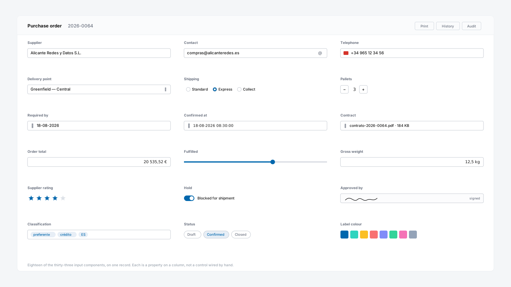
33 components in six families
Text 7, numeric 10, select 7, date 3, special 4 and colour 2 — counted from the editor's own component drawer, which holds 113 components in thirteen groups altogether. Each is a property on a metadata record rather than a control someone wired by hand, so validation, role-based visibility and the audit trail come with it.
Three input styles — governed, then delegated
Regular, outlined and filled are values on a preference row, not a theme compiled at design time. The company sets the default and decides whether it is binding; where it is not, a user who reads better with boxed fields sets boxed fields.
Behaviour is metadata, not code
Masks, defaults, computed values, readonly and nullable conditions, and enable rules are expressions on the column. A foreign key suggests its own autocomplete, wired to the parent table with the SQL, the caching and the keyboard handling already done.
The same field, under one permission model
However it is styled, the field is the same object: the same column, the same validation, the same role-based visibility, the same audit entry. Appearance is the only thing the preference changes.
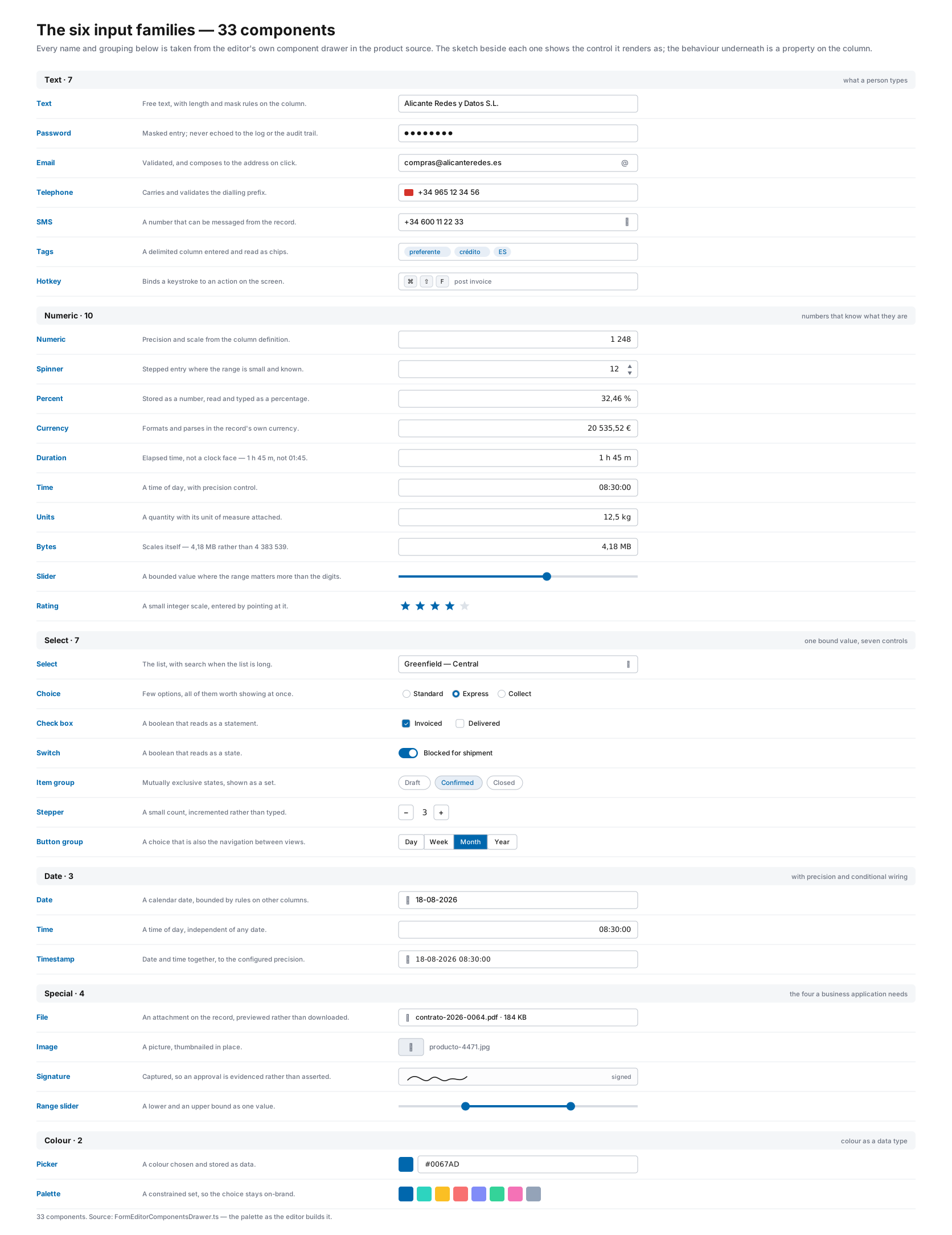
The six input families — 33 components
Text · 7
Text, password, email, telephone, SMS, tags and hotkey. Telephone carries its dialling prefix and validates against it. Tags turns a delimited column into chips a user adds and removes. Hotkey binds a keystroke to an action — the kind of thing operational users ask for on day two and most platforms never provide.
Numeric · 10
Numeric, spinner, percent, currency, duration, time, units, bytes, slider and rating. Currency, units and bytes format themselves for the reader and parse what the reader types back. Duration understands elapsed time rather than a clock face, which is the difference between "1 h 45 m" and a wrong answer.
Select · 7
Select, choice, check box, switch, item group, stepper and button group. One bound value, seven controls — the same column rendered as whichever fits the workflow, and changing between them is a property, not a rewrite.
Date · 3
Date, time and timestamp, each with precision control and conditional wiring to related fields — so a delivery date can be bounded by an order date without either of them knowing about the other in code.
Special · 4
File, image, signature capture and range slider. Signature matters wherever an approval has to be evidenced rather than asserted, and it is the component most often missing from a platform that otherwise looks complete.
Colour · 2
Picker and palette. Colour as a first-class data type rather than a hex string in a text box — because when a colour is data, something downstream is going to render with it.
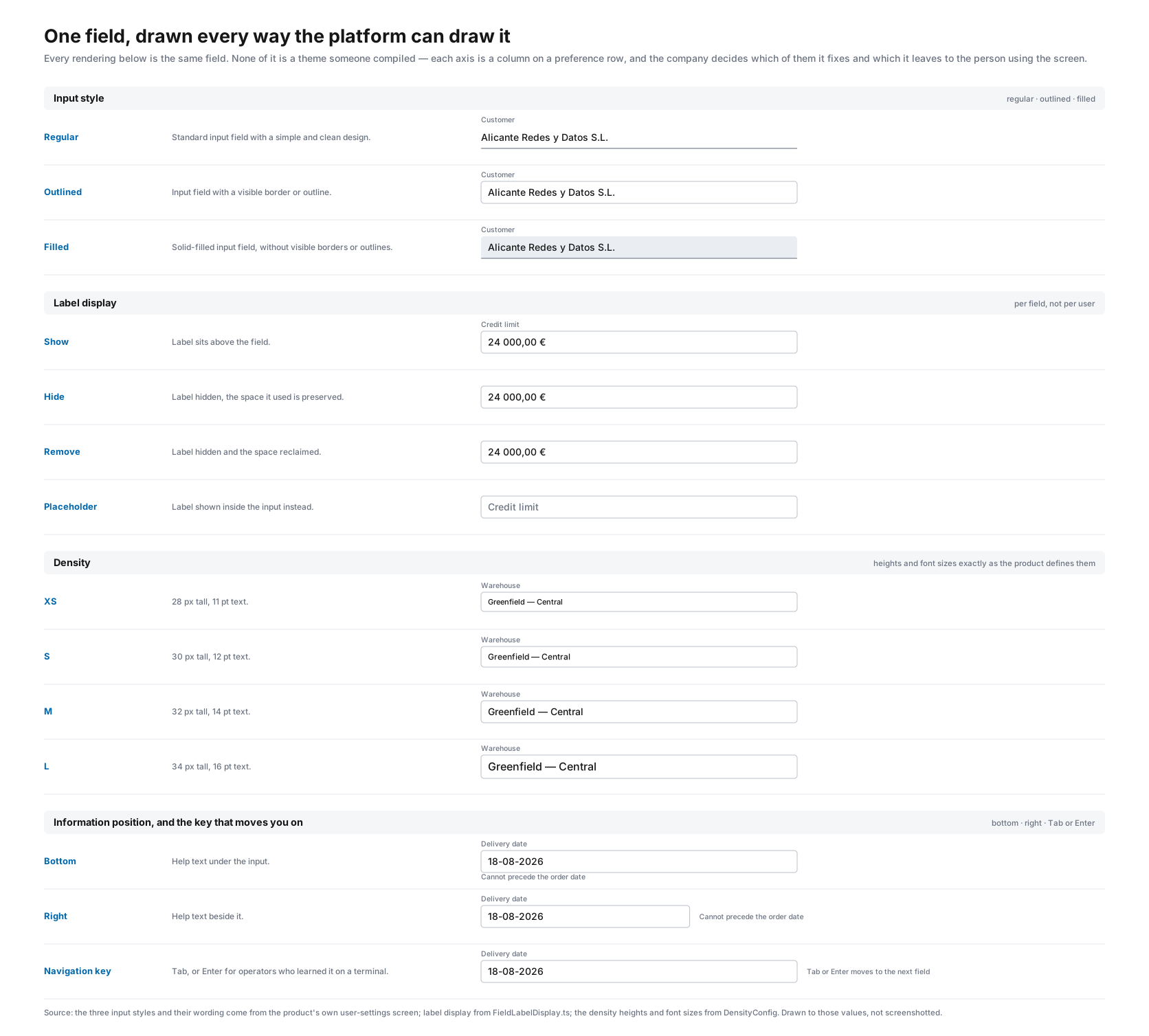
The styling axes — stored against the user, not the screen
These are columns on a preference row rather than decisions compiled into a screen. The company sets the defaults and keeps whichever are brand-critical or policy-critical under its own control; the rest are left to the individual. Either way the application is not rebuilt, re-themed or re-deployed — the front end renders from metadata and reads the preference on the way past.
Input style — regular, outlined or filled
Three renderings of every input in the catalogue. Regular underlines the field, outlined boxes it, filled gives it a background. It is one setting and it applies everywhere at once, so nobody meets a screen that ignored it — whether the value came from the company default or from the person using it.
Information position — below the field, or behind an icon
Help text, validation messages and hints either sit under the input or collapse into an icon inside it that opens on demand. On a dense operational screen that difference is several hundred pixels of vertical space, which is the difference between one screen and two.
Navigation key — Tab or Enter
Which key moves to the next field is a setting, and one most companies are happy to delegate. Anyone who has watched an experienced operator work a keying screen knows why: they learned Enter on a green screen twenty years ago and they are faster with it than any redesign will make them.
Label display — shown, hidden, removed or placeholder
Per field rather than per user: keep the label, hide it, remove it and reclaim the space it occupied, or push it into the input as a placeholder. A form that has to fit a known layout uses all four in the same screen.
Density, appearance and fonts
Compact, normal or comfortable spacing; light, dark or follow-the-system; and three font families — one for the application, one for tables, one for reports, because the right typeface for a data grid is not the right typeface for a printed document.
And the ones nobody advertises
Grid striping, snackbar behaviour, default query type, page and box lengths, and how a sub-cursor opens — embedded, in the current window, as a modal or in the sidebar. Small preferences, but they are the ones that make a system feel like it was built for the person using it.
Behaviour on the column, not in a handler
An input is not only a shape. What it accepts, what it computes, when it is required and when it is visible are all expressions on the metadata record — which is why the same rules hold whether the value arrives from a screen, an import, a script or an AI agent.
Validation, masks and defaults
Input masks, case handling, default values and the accepted range are column properties. The rule is declared once and enforced everywhere the column is written, rather than in whichever form happened to be built first.
Expressions — computed, readonly, nullable, hidden
A field can be computed from others, made readonly under a condition, made optional or required conditionally, or hidden entirely — each as an expression evaluated against the row in front of the user. A discount that only applies above a threshold is a line of metadata, not a form handler.
Foreign keys suggest their own autocomplete
When a column is part of a foreign key the editor recognises it from the metadata repository and offers the search-as-you-type input bound to the parent table. The platform supplies the query, the caching, the keyboard handling and the audit trail; the consultant supplies the click.
Modified values announce themselves
A field whose value differs from the saved one can carry an accent, so a half-edited form shows what is dirty without the user holding it in their head. On a long transactional screen this is the difference between confidence and a re-read.
Read-only is a state, not a disabled control
A field can be read-only with its own opacity — legible rather than greyed into uselessness — because a confirmed order still has to be read after it can no longer be changed. Disabled and read-only are different things, and treating them as the same is how a screen becomes unreadable at exactly the moment it matters.
Context colour
A field can take an accent from its context — a warning state, a company colour, a flag raised by a rule. It is a property rather than a stylesheet override, so nothing has to be maintained in parallel with the theme.
Who decides how a screen looks, and why it is not the developer
Most enterprise applications treat appearance as a design-time decision. Someone chooses a field style during the project, it is compiled into the front end, and every user of every screen lives with it for the life of the system. Changing it later is a front-end task with a release attached.
The platform treats it as data. Input style, information position, navigation key, density, appearance, the three font families and the colour pairs are columns on a preference row. The company sets the defaults and decides which of them are binding — branding and anything load-bearing for consistency stay under its control. What it chooses not to fix, the individual adjusts. Nothing is rebuilt and nothing is redeployed in either case, because there is nothing to rebuild: the front end renders from metadata and reads the preference on the way past.
That matters most for the users nobody designs for: the operator who keys with Enter because they learned it on a terminal, the reader who needs boxed fields to find the edges, the analyst on a laptop who needs the help text out of the way. A platform that cannot accommodate them makes them slower every day and calls it a design standard.