The component an operational user spends the day inside, and the one most platforms get wrong.
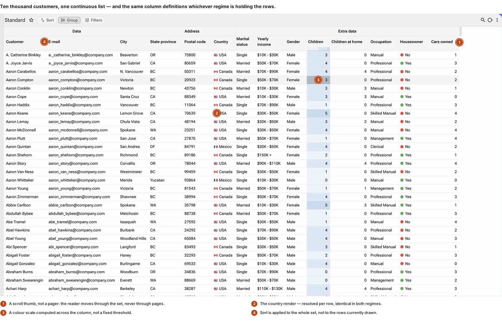
Two regimes share one widget. Against a result set of unlimited size the rows stay on the server and the grid scrolls through them; against a bounded set delivered whole, the same grid filters, ranks, groups and re-shapes in memory with no round trip between one question and the next. On top of that sits the work: keyboard navigation cell by cell, range selection, copy out to a spreadsheet, editing in place under the same validation as the form, and a row that expands onto its own related objects without leaving the list.
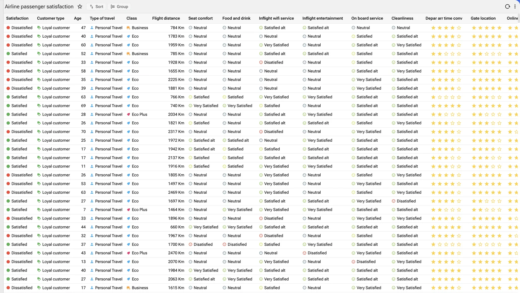
Two regimes, one widget
Server-paginated for result sets larger than any browser could hold, and client-held for the bounded set a person is actually interrogating. The same column definitions, the same renders, the same wiring — the difference is only where the rows live.
Scrolls without loading
The user perceives one continuous list; the network sees a series of small page requests, and the browser holds only the rows it is drawing. Row count stops being a design constraint.
Works the way a spreadsheet works
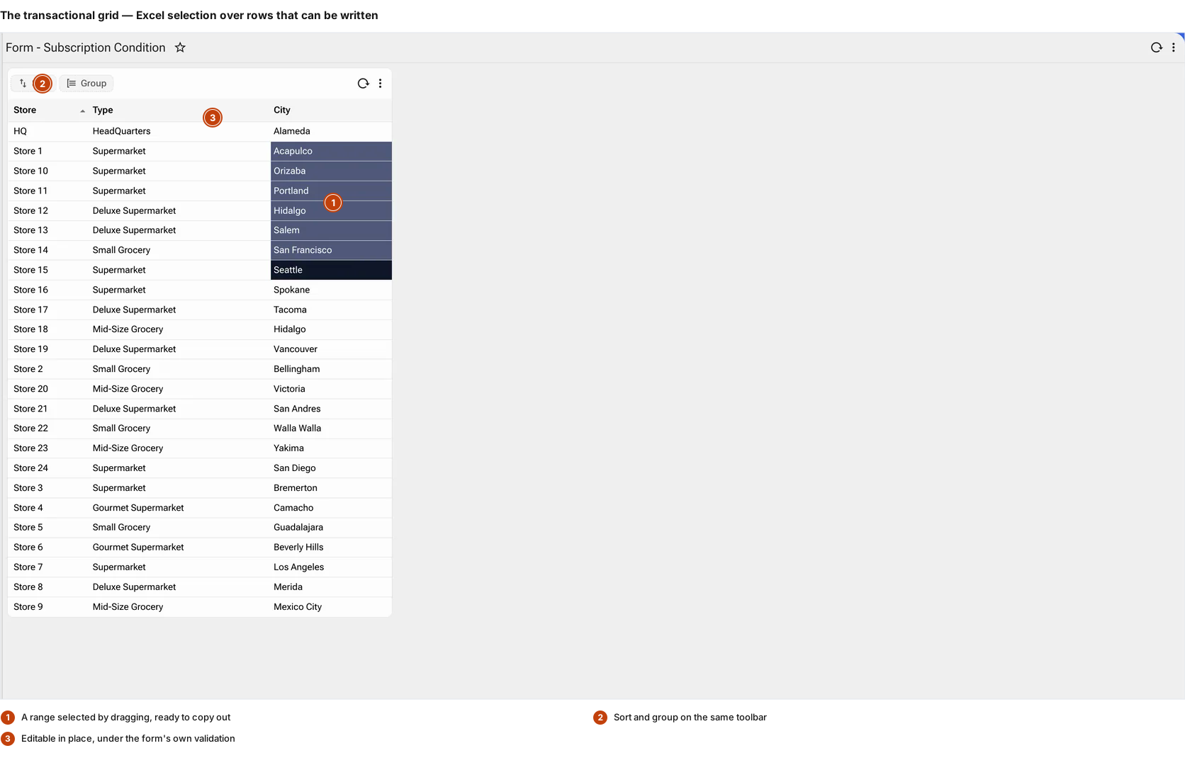
Arrow keys move cell by cell, ranges select, and the selection copies out to a spreadsheet. Operational users are fast in Excel; the grid does not ask them to be slower here.
A row opens onto its children
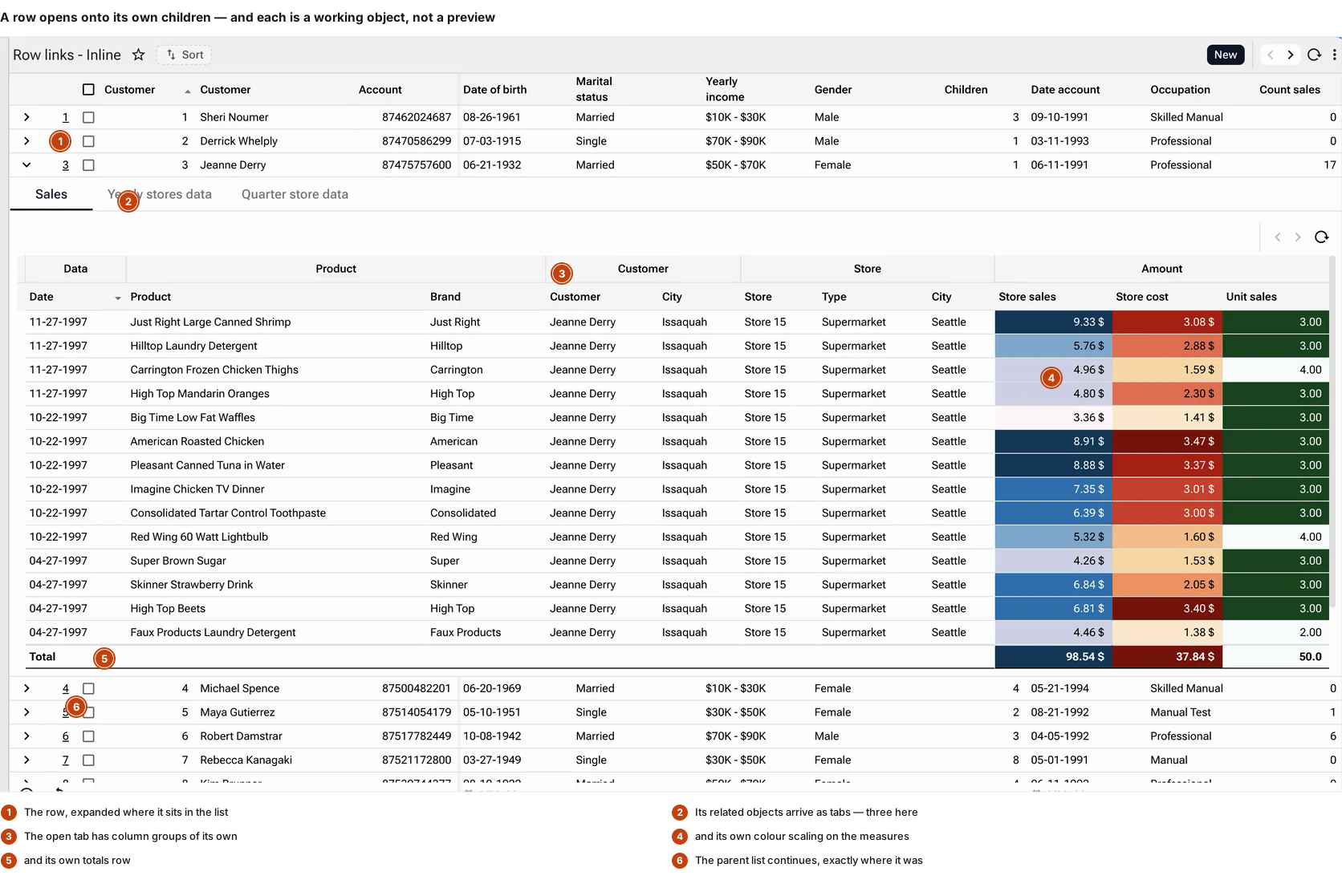
Expanding a row reveals its related objects as tabs — each a working object with its own columns, grouping, totals and permitted edits. The list never has to be left.
Where the rows live decides everything else
Server-paginated — for sets nobody can hold
The rows stay on the server. The platform fetches a page, the grid virtual-scrolls through it, and the next page arrives before the user reaches the end of the last. What the browser actually holds is the rows that fit the viewport plus two, plus a configurable buffer above and below — so the DOM stays the same size whether the query returned five thousand rows or five million.
Client-held — for the set being interrogated
A bounded result set delivered whole, so filtering, ranking, measuring and re-shaping happen in memory. No round trip, no re-query, no waiting between one question and the next — which is the difference between an analyst exploring and an analyst submitting requests.
The same grid either way
Same widget, same column definitions, same render system, same wiring. A screen does not have to be rebuilt because a table grew, and a developer does not choose between a "list component" and a "grid component" at design time.
Hierarchy, two ways
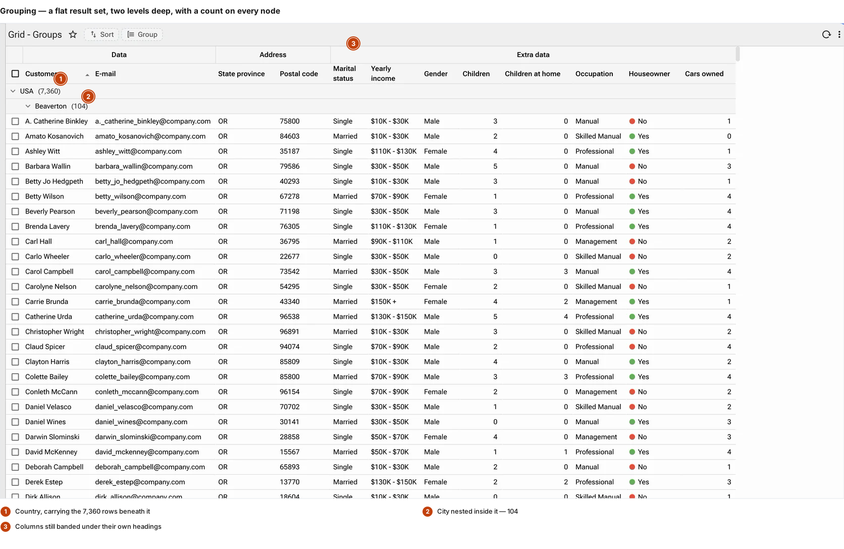
Both are properties on the view. The SQL underneath returned a flat list in each case.
Grouping — by one column or by four
Group and the flat set becomes a tree with a count on every node, collapsed or expanded to a chosen depth. Per level you can set the icon, the colour, whether counts show, whether the grouped column stays in the row, and which columns remain relevant on a group line.
Tree grid — following the parent key
Where the data is already hierarchical the grid follows the parent relationship instead: a reporting line, a bill of materials, a chart of accounts, a folder structure. It is told which column is the id, which is the parent, which marks a folder, and how many levels to open by default.
Counts that mean something
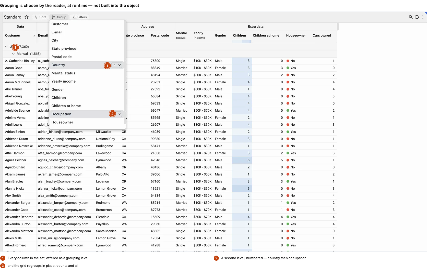
A group row carrying "7,360" is answering a question the reader would otherwise have to run. Collapsed to its top level, a grouped grid is a distribution; opened one branch, it is the rows behind that number — and it is one click between them.
Reading a wide, deep table without drowning in it
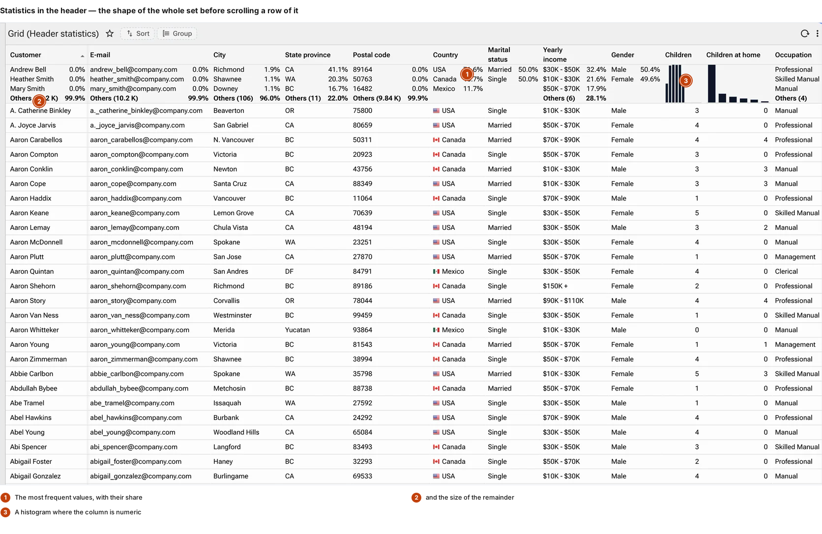
Statistics in the header
Each column header can carry its own summary — the most frequent values with their share, the size of the remainder, a histogram where the column is numeric. How many entries appear is a setting. The reader sees the shape of the whole set before scrolling a row of it.
Column groups, frozen columns, and a width that behaves
Columns band under headings so a forty-column set reads as a few related blocks. Any number can be frozen to the left or the right while the rest scrolls. Minimum row height, maximum column width and whether the grid fills its container are all explicit rather than emergent. Columns are virtualised horizontally as well as rows vertically, so width is no more of a constraint than depth.
Renders inside the cell
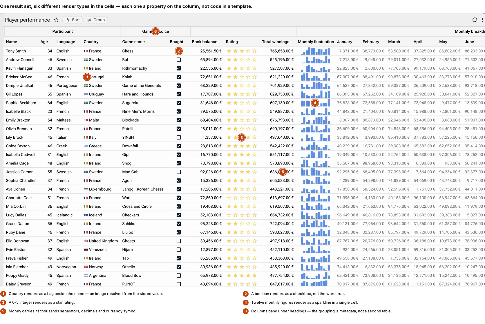
A cell is not limited to text: micro charts, status chips, colour rules evaluated per row, icons, ratings, flags, and negative values in accounting convention. A twelve-month column reads as a sparkline with the twelve figures still beside it.
What the reader chose, remembered
Column width, order, freezing and visibility are stored per user against the object. The analyst who froze the first two columns finds them frozen tomorrow, and nobody else's screen changed.
Working in the grid, not just looking at it
Five Excel modes, not one
The grid declares how spreadsheet-like it is. NONE switches cell navigation off entirely. EXCEL_SELECT gives arrow-key movement, range selection and copy-out with no editing. Then three editing modes that differ in when the write happens — EDIT_CELL_AUTO_SAVE commits as each cell is left, EDIT_ROW_AUTO_SAVE commits when the row is, and EDIT_MANUAL_SAVE waits to be told. A stock count and a ledger want different answers, and the difference is a setting.
Drag to copy, with a confirmation
A selection can be dragged across a range to copy into it, the way a fill handle behaves in a spreadsheet — and the grid holds the operation in a waiting state until it is confirmed, refusing any further drag until it is resolved. Bulk-filling a column by hand is a common enough operation that not having it sends people back to Excel.
Four selection modes, including the required ones
Rows select by checkbox, by clicking the row, or not at all — and the cardinality is declared as one of four: SINGLE, MULTIPLE, or the two that cannot be emptied, SINGLE_REQUIRED and MULTIPLE_REQUIRED, where the last selected row cannot be unselected. A picker that must return something is a different component from a list that may return nothing, and saying so removes a class of validation code.
Editing in place, under the form's rules
Where the object allows it, rows are inserted and edited in the grid itself — with the same validation, the same role-based visibility and the same audit trail as the form. The grid is another view of the object, not a weaker path to the same table.
Rows that move
Drag to reorder where the order is data, and drag to reparent in a tree grid. What looks like a convenience is usually the point: a priority, a sequence or a hierarchy that someone has to be able to change without opening a maintenance screen.
Sort and group are the reader's, not the screen's
Neither is built into the object. Both are chosen at runtime by whoever is looking, against the set already in front of them — which is the difference between a report someone requests and a question someone answers.
Group by any column, then by another inside it
The menu is the column list, and each entry takes a level number. Country at one, occupation at two, and the flat set becomes a two-level tree with counts. Nothing was re-queried and nothing about the object changed.
Sort as an ordered stack
Not one column and a direction — a stack, dragged into precedence, each entry carrying its own ascending or descending, applied or reset as a whole. The set is already in the browser, so the reordering is immediate.
Filters that never leave the browser
Each column filters by matching text, by numeric range, or by a list of its distinct values with the number of appearances beside each. Filters compose across columns and reset per column.
The cell is a rendering surface
Sixteen chart types, inside a single cell
Bar, line, area, progress, gauge, dial, distribution, min-max and the rest — small enough to render in a row, so a table reads as a dashboard without becoming one.
Colour computed, not hard-coded
Quartiles across the column, simple distribution, rank order, repetition, a gradient between two colours — and a direction, so the platform knows whether high is good.
The conventions the reader already uses
Status with its icon, totals shaded by sign, and losses in parentheses the way the people reading them write them.
A row opens onto its own children — and they are objects too
This is the shape of most enterprise work: a record and the things that hang off it. It does not need a second screen.
Related objects arrive as tabs
Expand a row and its related objects appear beneath it, one tab each. An order opens onto its lines, its shipments and its invoices; a customer onto sales, yearly figures and quarterly ones.
Each tab is a working object
Not a preview and not a drill-down that leaves the page. Each is a complete object with its own columns, its own grouping, its own totals row, and its own insert and update where permitted.
The list never moves
Close the row and the list is exactly where it was — same scroll position, same filters, same sort. The cost of looking at a detail is not losing your place among the hundred rows you were working through.
Why the grid is where a platform is judged
Every enterprise application is, in the end, a great many rows. The forms get the attention in a demonstration, but the grid is where the working day actually happens — the list someone scrolls for an hour, filters twice, sorts three ways and copies half of into a spreadsheet because the tool would not let them do it in place.
That is why the grid carries so much here. Not because a feature list is impressive, but because each of these exists to remove a specific reason someone would otherwise leave the application: the statistics because they would otherwise run a query to find the shape of the data, the Excel selection because they would otherwise export, the inline children because they would otherwise open a second screen and lose their place, the per-user column state because they would otherwise re-arrange the same columns every morning.
A grid that does none of those is not a smaller grid. It is a reason to keep a spreadsheet beside the system, and once that spreadsheet exists it becomes the place the real work is done and the system becomes the place it is typed up afterwards.