A form is a record with a layout — which is why the dashboard and the search screen turn out to be forms as well.
This is the screen an operational user spends the day inside, and its parts are the same everywhere: a header carrying the breadcrumb and an action bar that changes with the record’s state, boxes of related fields that collapse or hide by role, a tab strip over the record’s child collections — each the full grid, not a table drawn to look like one — and a rail holding identity, state and computed values. None of that is markup somebody wrote. It is a position and a binding on a metadata record, which is what lets the same construction hold a document, a dashboard and a search screen.
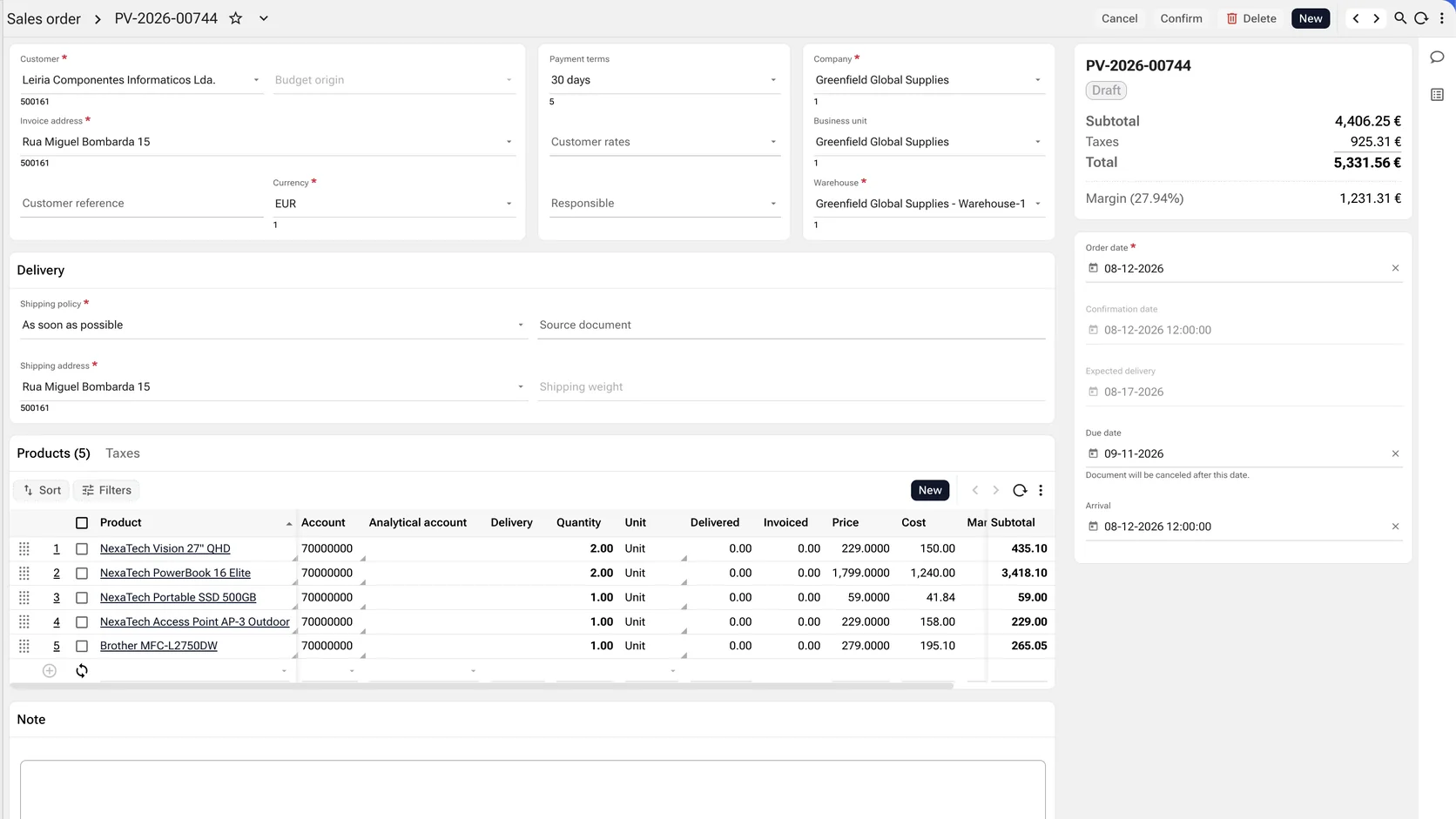
Boxes, not a wall of fields
Fields group into boxes — the layout container, spanning as many columns and rows of the canvas as they need, each holding an ordered set of tabs. A box can carry a title on its border, collapse, appear only when a condition holds, or not render at all for a role that has no business seeing it.
Collections are the grid, inside the form
A child collection is the same grid component the list surfaces use: its own toolbar, sort, filter, add-row, paging, drag handles to reorder, sortable headers and inline editing. A form is not a special case with a table drawn into it.
The header belongs to the record
Breadcrumb, identifier, favourite, previous and next through the result set, refresh, search, and an action bar whose contents follow the record’s state. None of it is per-screen furniture that somebody assembles again each time.
Read-only is computed, not a variant
Whether this reader can change this record is the product of four independent rules — the permissions on the object, an authorisation expression evaluated against the row, enable expressions on the layout and its tabs, and whether the column is editable at all. The same screen renders the answer. There is no view screen kept in step with an edit screen.
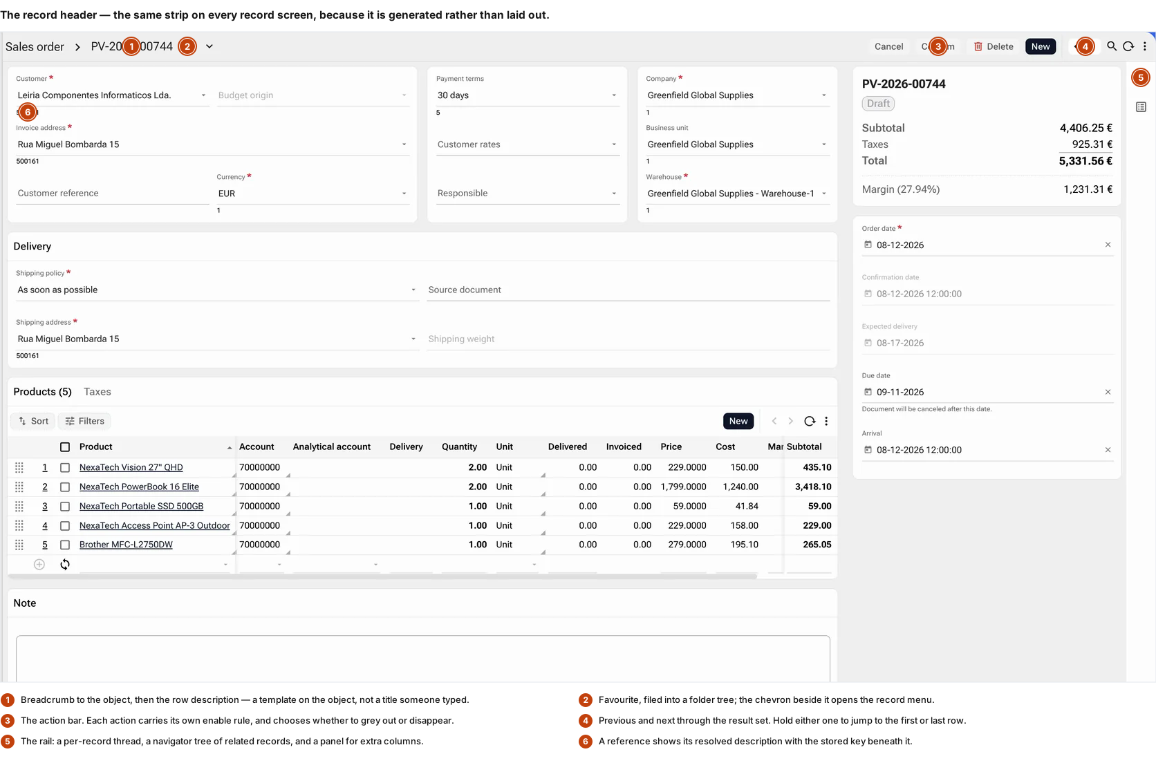
The record header
The strip along the top is the same on every record screen in the application, because it is generated rather than laid out. It answers where am I, which record is this, what can I do to it, and how do I get to the next one.
Every action carries its own rule
An action has a permission check, a client-side expression evaluated as the reader types, and a server-side one evaluated against the row — plus a choice, per action, between rendering it disabled and not rendering it at all. Whether a reader should see what they cannot do is a decision, and it is made per action rather than per framework.
Navigation without leaving the record
Previous and next move through the result set the record was opened from — hold either to jump to the first or last row — so reviewing forty records is forty keystrokes rather than forty round trips through a list.
Three panels, beside the record
A thread carrying its conversation, its files and its tasks; a navigator tree of the records related to it; and a panel for columns kept off the main canvas. All three open beside the form rather than in a dialog over it, so the record stays readable while its correspondence is.
Both halves of a reference
A lookup shows the resolved description with the stored key beneath it — the reader sees the name, the person reconciling against another system sees the key. The same control offers an advanced search when the list is long, and adds a missing parent record inline rather than sending the user to another screen to create it.
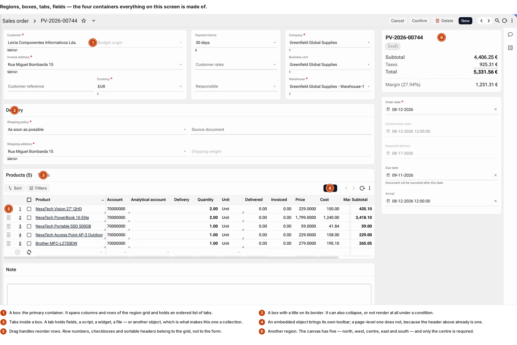
Blocks, collections and the summary rail
Everything below the header is arrangement. Blocks hold fields, the tab strip holds collections, the rail holds identity and computed values — and each of those is a position and a binding on a metadata record rather than markup somebody wrote.
Five regions, and boxes inside them
North, west, centre, east and south, of which only the centre is required; the side regions are resizable and collapsible. A box sits in a region, spans as many columns and rows as it needs, and holds tabs. Grouping fields is the cheapest thing a form does and the first thing hand-built screens get wrong, because there the grouping is markup and the rule that governs it lives somewhere else.
A tab holds one of six things
Data fields, query fields, a script, a widget, a file — or another object, which is what a collection is. Each tab states how many rows are behind it before it is opened, and adding one is a metadata entry rather than a redesign.
The collection is a working grid
Sort, filter, add a row, page, refresh, reorder by dragging, and edit either a row at a time or cell by cell as a spreadsheet does. It is the grid component with its ordinary toolbar — and it has one precisely because it is embedded; a page-level grid does without, since the header above it already is a toolbar.
The parent decides what the child shows
A collection subscribes to the selection above it, so choosing a row re-runs the child against it. The subscription carries a checksum, which is how a child that has gone stale behind an open screen is detected rather than silently written over.
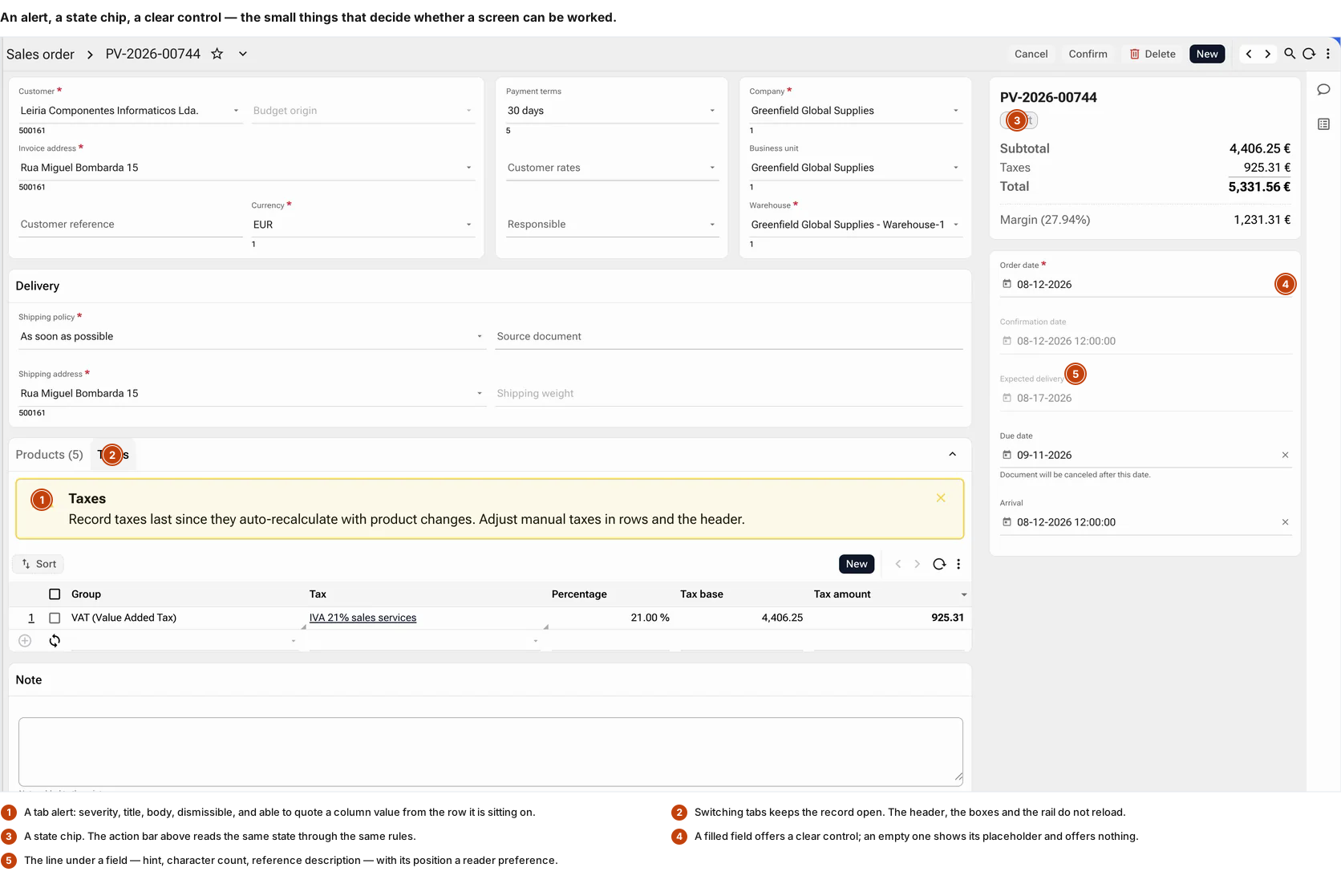
The small affordances that decide whether a screen can be worked
The difference between a form that is usable at eight in the morning and one that is not tends to be here — in whether the screen says what it wants, whether a value can be cleared without selecting and deleting it, and whether switching tabs costs a reload.
An alert belongs to a tab, and knows the row
It carries a severity, a title, a body and an icon, sits above or below the content, and can be dismissed. It can quote a value from the record it is sitting on. And the rule that shows it is either a server expression — fixed until the next save and reload — or a client expression that re-evaluates as the reader types. Which of the two is a deliberate choice, not an implementation detail.
Fields that appear when they are wanted
A field is ordinary, secondary, or a preview. Secondary fields sit behind a Show more control on their box; preview fields surface on the box itself while it is collapsed. A long record becomes short without anything being taken away from it.
The line under the field, where the reader wants it
Hint, validation message, character count and the description behind a reference all share one slot — and whether it sits beneath the field or behind an icon beside it is the reader’s preference, held with their density and input style rather than compiled into the screen.
A state chip the actions agree with
The chip in the rail and the actions in the header read the same state. They cannot disagree, because neither is a copy of it.
A dashboard is a form
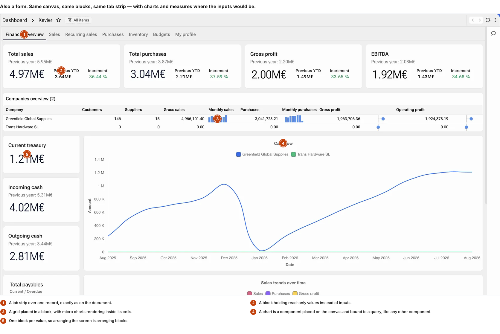
This is the one that changes what the word means. Not a separate product bolted to the side of the application: the same canvas, the same blocks, the same tab strip and the same metadata record, with charts and read-only values placed where the inputs would otherwise go.
Blocks hold values instead of inputs
A card carrying a figure, a comparison and the variance between them is a block with bound values. Nothing about the container differs from the block holding a name and an address two screens away.
The grid brings its renders with it
Rows here carry sparklines and dot plots inside their cells — the same in-cell rendering the analytical grid uses, because it is the same component reading the same column properties.
A chart is a placed component
Bound to a query and positioned on the canvas, as an input is bound to a column and positioned on the canvas. There is no separate reporting tool with its own layout engine to learn.
And the same permission model
A value is a query, and a query runs under the reader’s role. A dashboard cannot show a figure the reader is not entitled to, because the entitlement is not enforced at the dashboard.
So is the search screen
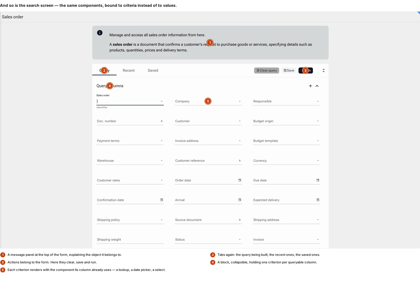
Search in an application of this kind is not a text box. It is a form over the same object, with one criterion per queryable column, each rendered by the component that column already uses — which is why a date criterion is a date picker and a reference criterion is the lookup with its autocomplete.
Generated from the same metadata
The criteria are the object’s columns. Adding a field to the record adds it to the search, because there is one definition and two renderings of it rather than two definitions to keep in step.
A criterion is a component
No search widget is written per column. The component that renders the value renders the criterion, with its validation, its formatting and its keyboard behaviour already attached.
A query is an object
Recent and saved are tabs on this form. A question worth asking twice is kept and named rather than retyped, and can be handed to someone else.
Actions belong to the form
Clear, save, run. The same header pattern as the record screen, doing the three things a query can have done to it.
Why the form is the hardest surface to fake
A grid can be demonstrated with any dataset. A chart can be demonstrated with any numbers. A form cannot: it only becomes convincing when the header knows what state the record is in, when a collection can actually be worked rather than read, and when the same construction turns out to be holding a dashboard on the next screen.
That is the reason this page shows a record, a dashboard and a search screen rather than three variations on one. If those were screens somebody had drawn, they would share a stylesheet and nothing else — three layouts, three sets of state handling, three places for the tab strip to behave slightly differently. Here they share a canvas, so they cannot drift.
The practical consequence is the one that matters to whoever maintains them. When a screen is a metadata record, a new screen is a record; a new field is a column; a rule that changes is an expression edited in one place. When a screen is code, each of those is a change that has to be found, made, reviewed and released everywhere it was written.