Charts ordered by the question they answer, not by the shape they make.
Magnitude, change over time, part to whole, distribution, correlation, hierarchy, flow and network, and radial. Thirty types across those eight families, each a view type on a result set and configured rather than coded — so the decision in front of a consultant is which encoding suits the question, not whether the charting library supports it. Sixteen of them are small enough to render inside a single grid cell, which is what lets a table read as a dashboard without becoming one.
The chart is wired to the columns, not built from them
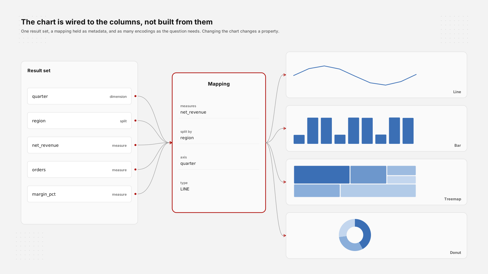
Thirty charts, grouped by what they encode
Ordered by the question each one answers rather than by the shape it happens to make. Every frame below is the component rendering in the product; each says what it is for, so the choice in front of a consultant is which encoding suits the question rather than which one the library supports.
Magnitude · 5
How much, compared with what. The first question anyone asks of a number, and the family most often answered with the wrong chart.
Comparison across categories
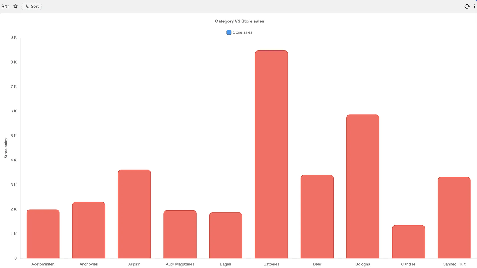
Comparing quantities across categories
The default for comparing unordered categories. Sorting, colour, orientation and the value labels are all properties on the view.
When the labels are long
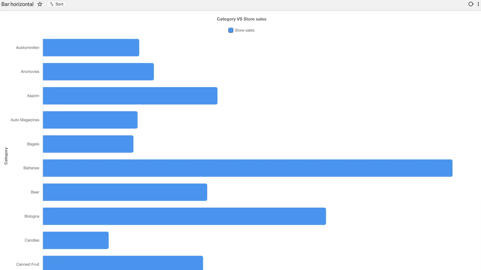
Comparing quantities across categories
Category names that would collide on a horizontal axis get room to breathe. The same data, rotated by a setting.
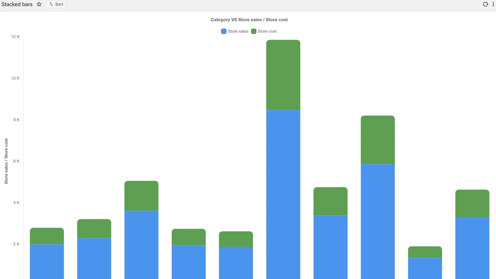
Two measures in one column
Comparing quantities across categories
Sales and cost per category, stacked so the total and the split read at once. Stacking is a configuration on the measure list.
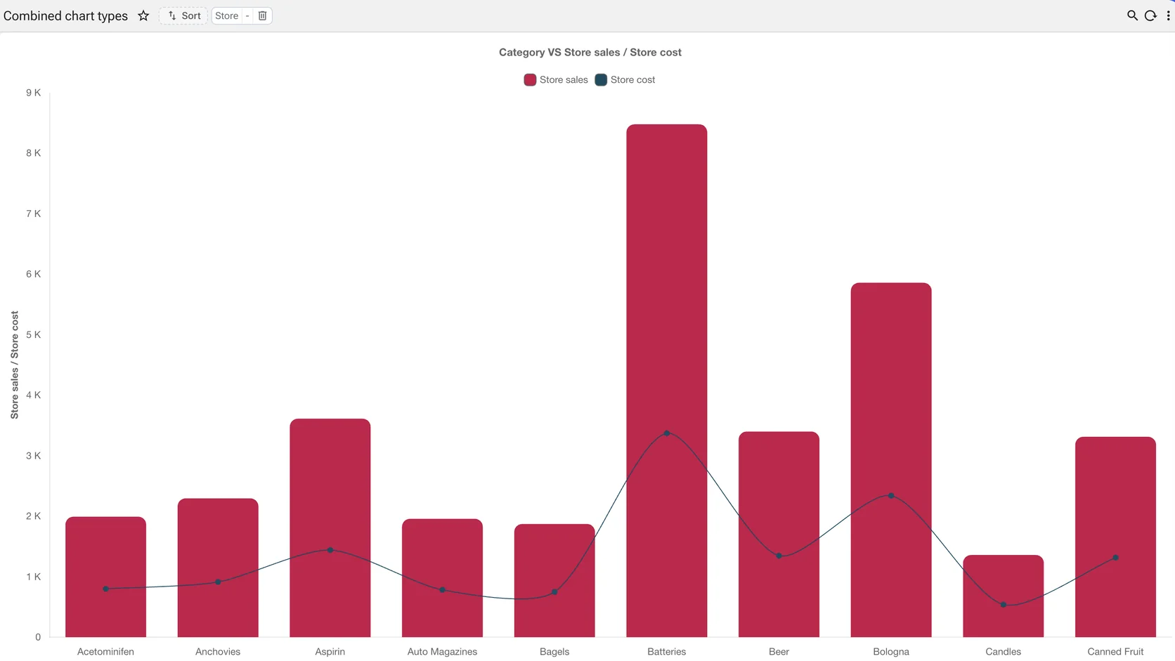
Two scales, one picture
Comparing quantities across categories
A measure that belongs on bars and a measure that belongs on a line, sharing the axis. The combination is declared, not drawn.
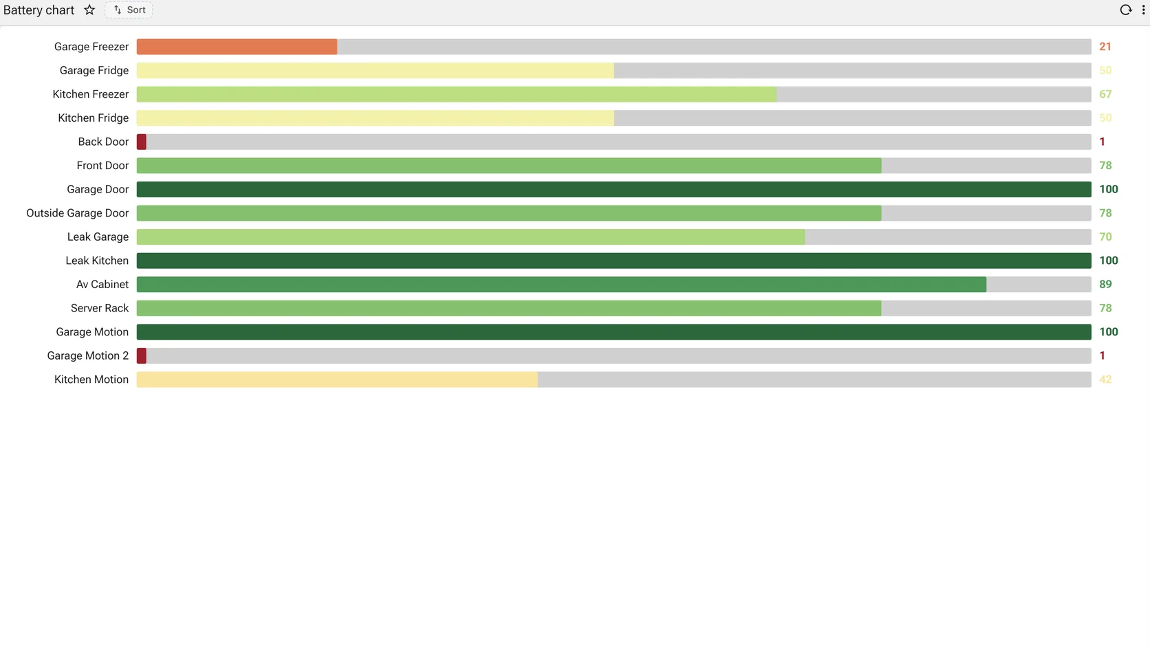
Progress against a target, in a list
Comparing quantities across categories
One row per item, the fill showing how far along it is and the colour saying whether that is good. For a list of things that each have a target.
Change over time · 4
A series with an order that matters. The reader is looking for direction, rate and turning points, not for individual values.
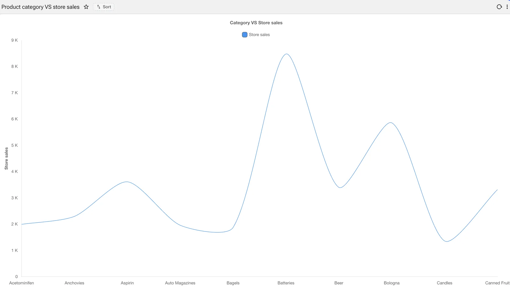
Trend over an ordered dimension
A measure along an ordered axis
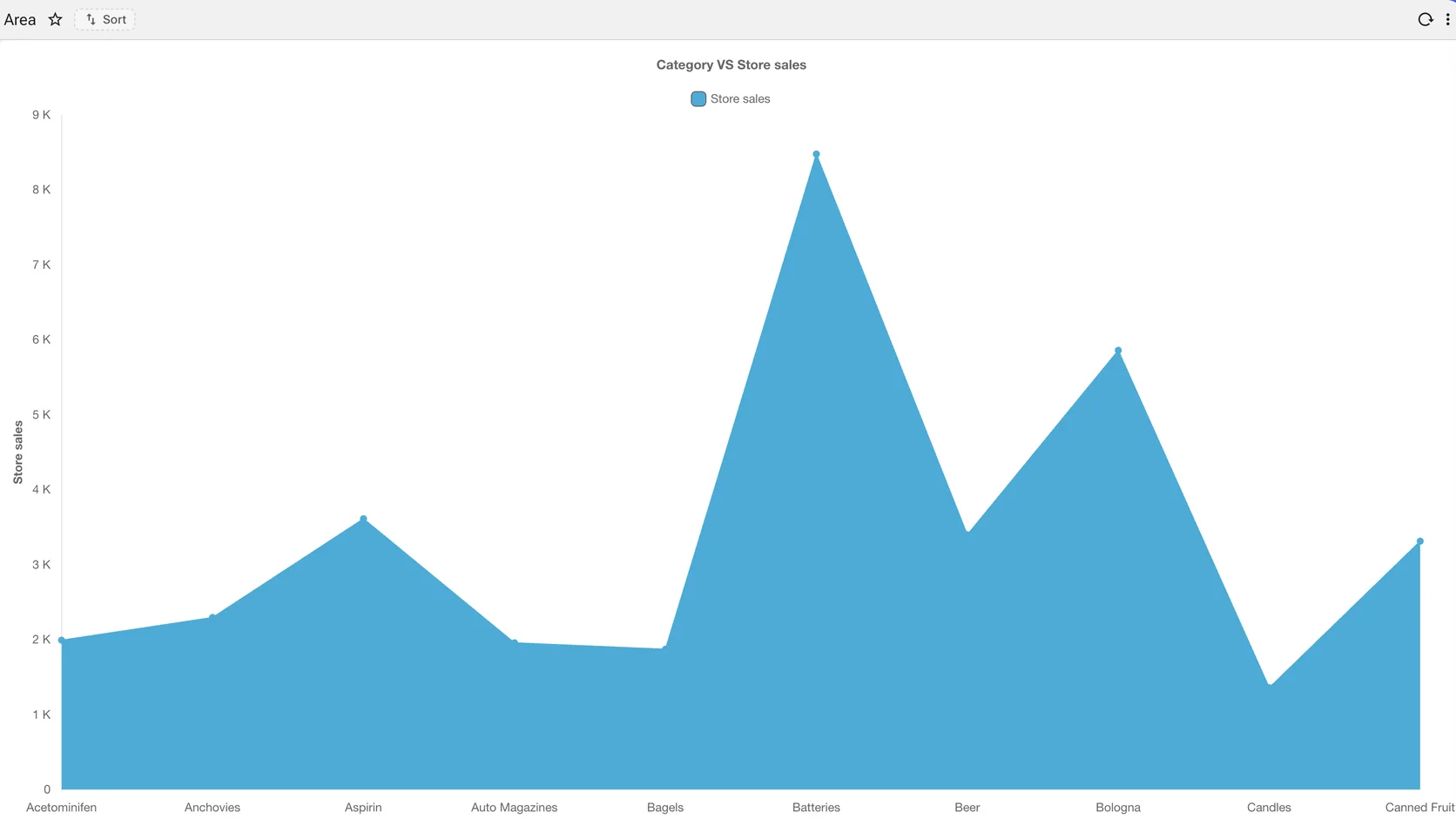
Store sales across product categories. The smoothing, the axis labels and the legend are settings; the query returned two columns.
The same series, filled
A measure along an ordered axis
Same query, same two columns, one property changed. Filling the area reads as volume rather than direction — the choice belongs to whoever is reading it, not to whoever wrote the SQL.
More than one series, stacked in depth
A measure along an ordered axis
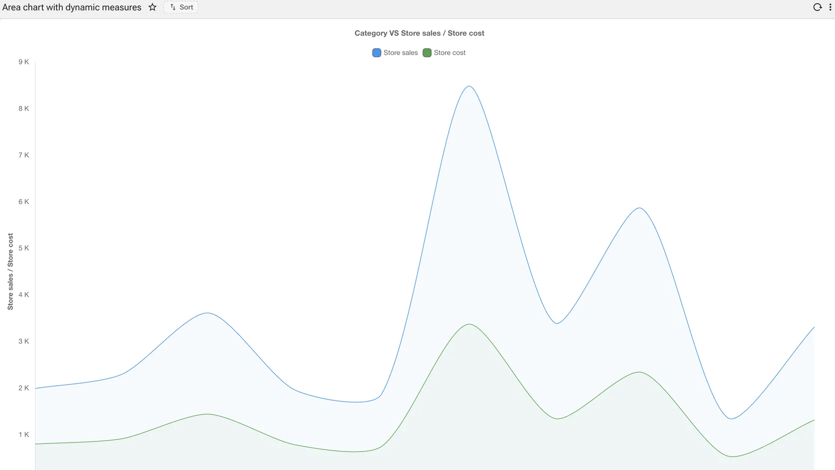
Two measures over the same axis, each with its own fill. Adding a series is adding a column to the measure list, not rewriting the chart.
How a total was arrived at
A measure along an ordered axis
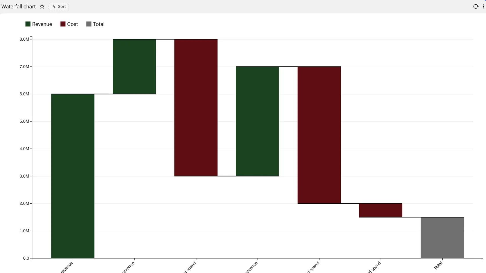
Revenue up, cost down, and the bridge to the total. The chart finance asks for when the question is not what the number is but how it got there.
Part to whole · 6
A total, decomposed. Reach for these when the total is meaningful; when it is not, a magnitude chart says more.
Share of a whole
How the total divides
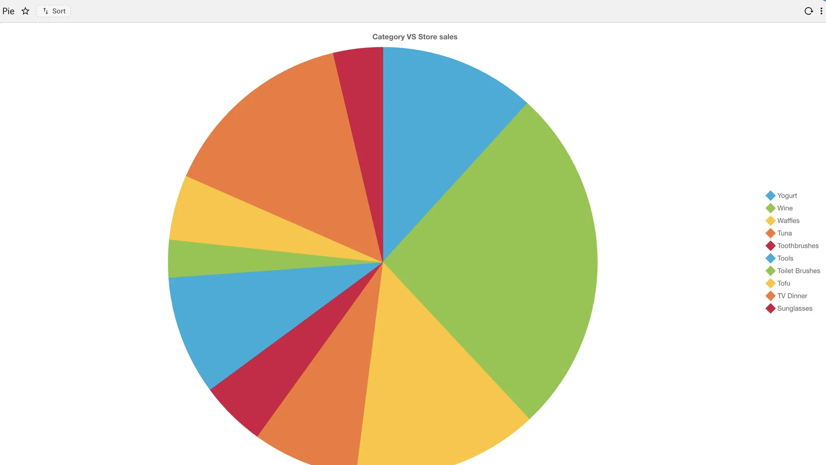
Segments by category with the legend naming each. Honest for a handful of slices; the platform will draw as many as the query returns, which is its own kind of warning.
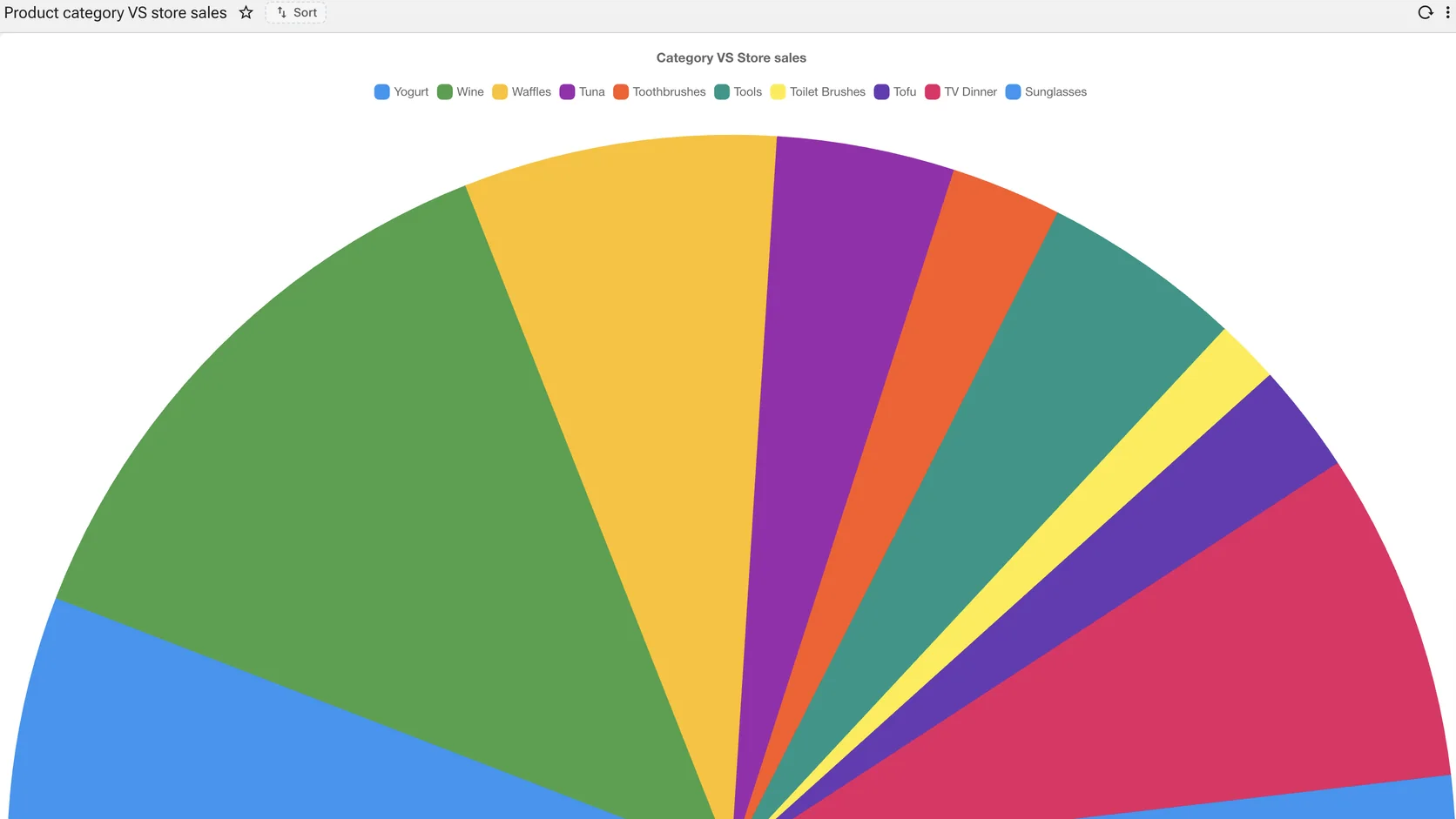
The same share, in half the height
How the total divides
A semicircle instead of a circle. The same figures where the layout has width but not height — a dashboard row, a report header.
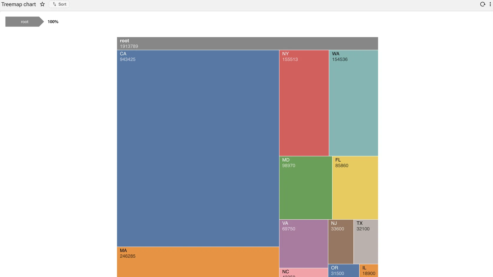
The same hierarchy, packed
How the total divides
Rectangles nested and sized by value. Where a sunburst shows structure, a treemap shows how much of the total each branch takes.
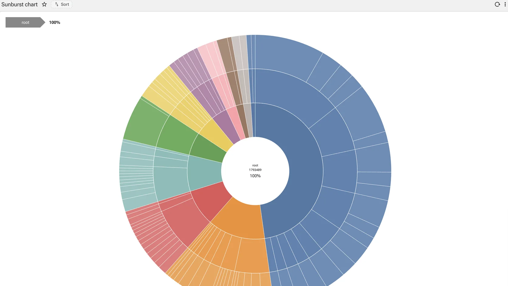
A hierarchy by proportion
How the total divides
Concentric rings, one per level, each segment sized by its share. The whole hierarchy and its proportions in one figure.
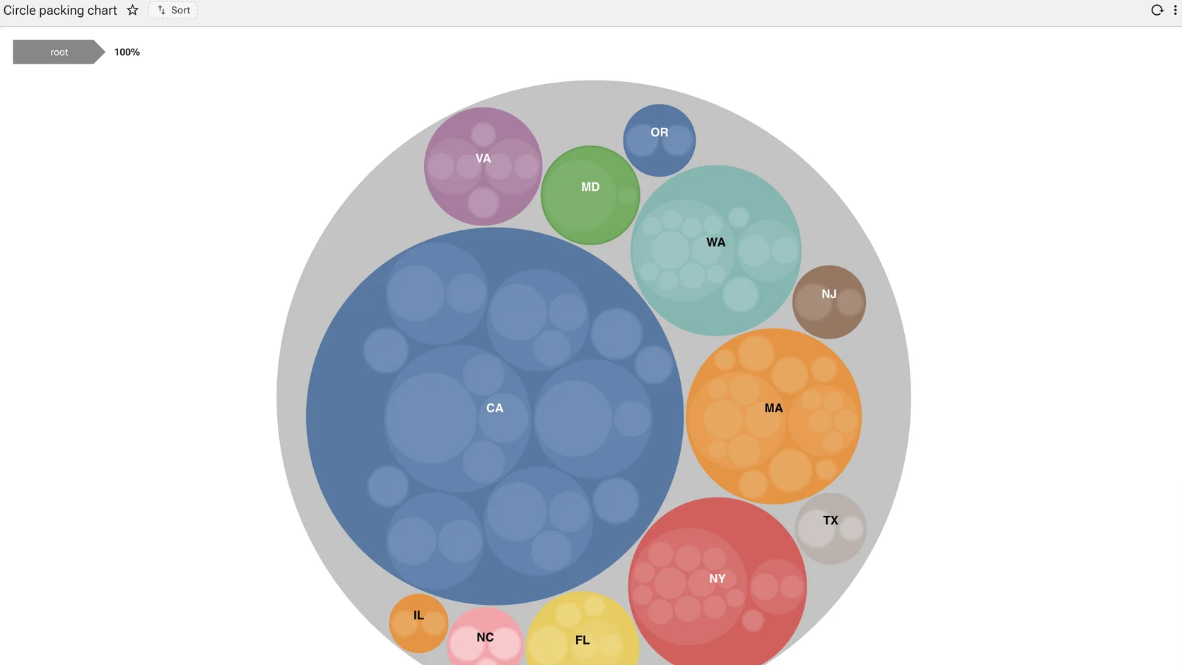
Nesting made obvious
How the total divides
Circles inside circles. The least precise of the hierarchy charts and the easiest to read at a glance — which is often the point.
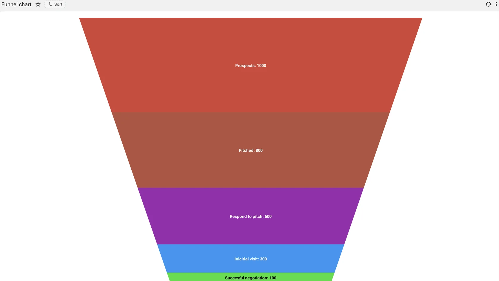
Stage-to-stage attrition
How the total divides
Prospects to pitched to proposal to closed, each stage labelled with what survived it. The proportions are the argument.
Distribution · 4
The shape of a set rather than its total — where the mass sits, how wide the spread is, and what is out at the edges.
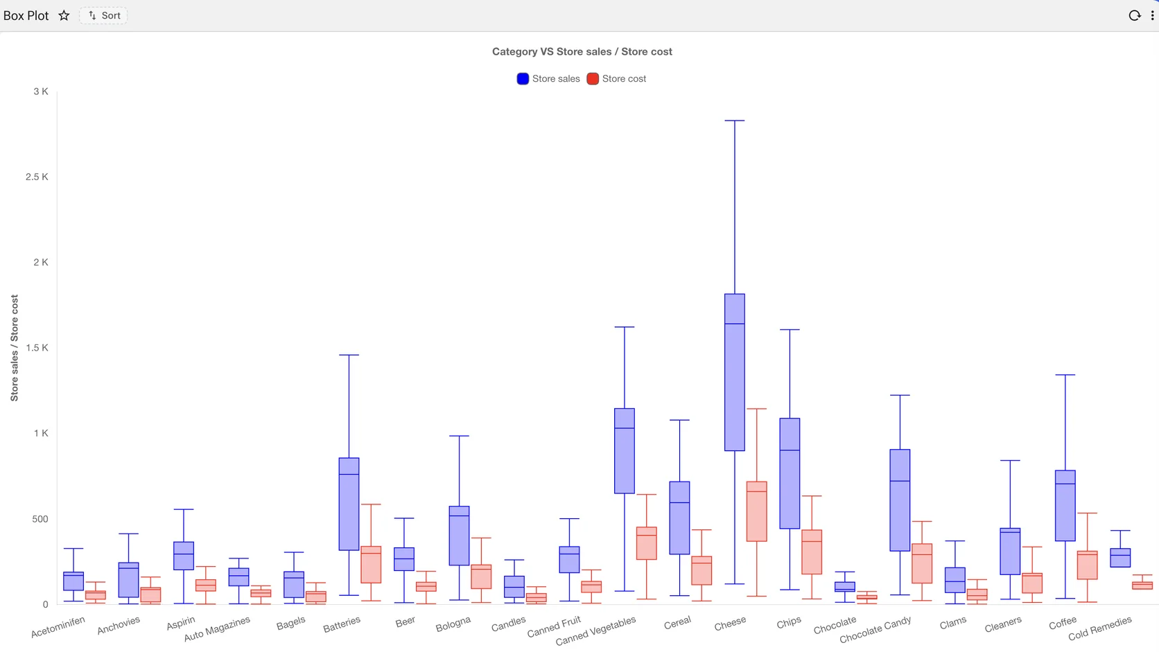
Distribution, not just the average
Shape, spread and density rather than the average
Median, quartiles and outliers per category. The chart an analyst asks for when the average is hiding the problem.
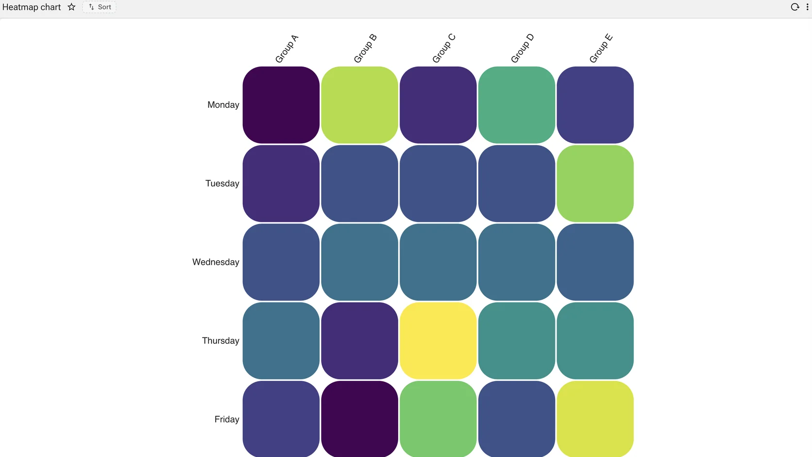
Two dimensions, colour as the measure
Shape, spread and density rather than the average
Group against weekday, colour carrying the value, with a continuous scale underneath. The densest way to show a two-dimensional measure.
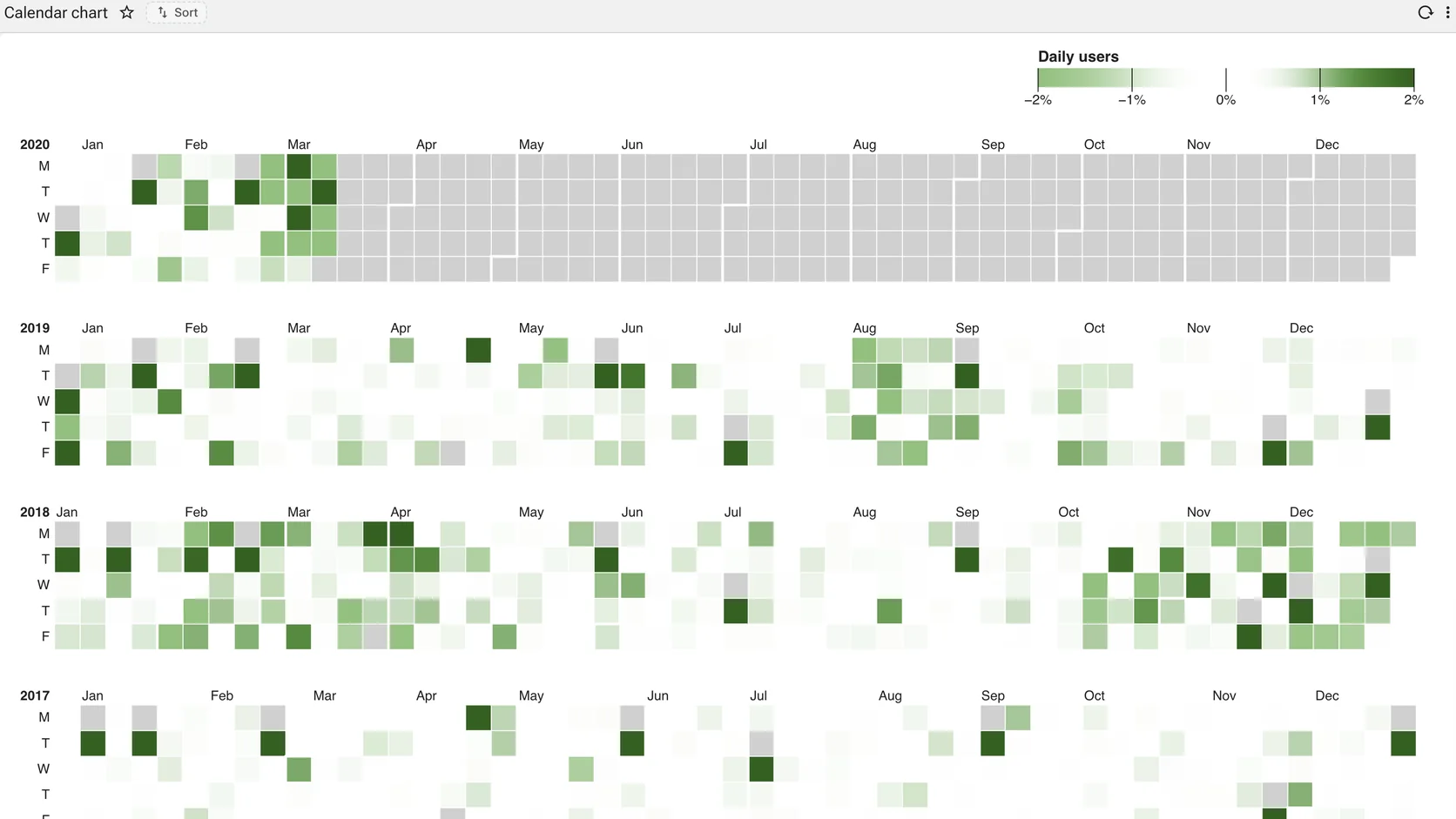
Seasonality without an axis
Shape, spread and density rather than the average
Years as rows, days as cells, intensity as the measure. Seasonality, weekends and outages read straight off it with no axis to interpret.
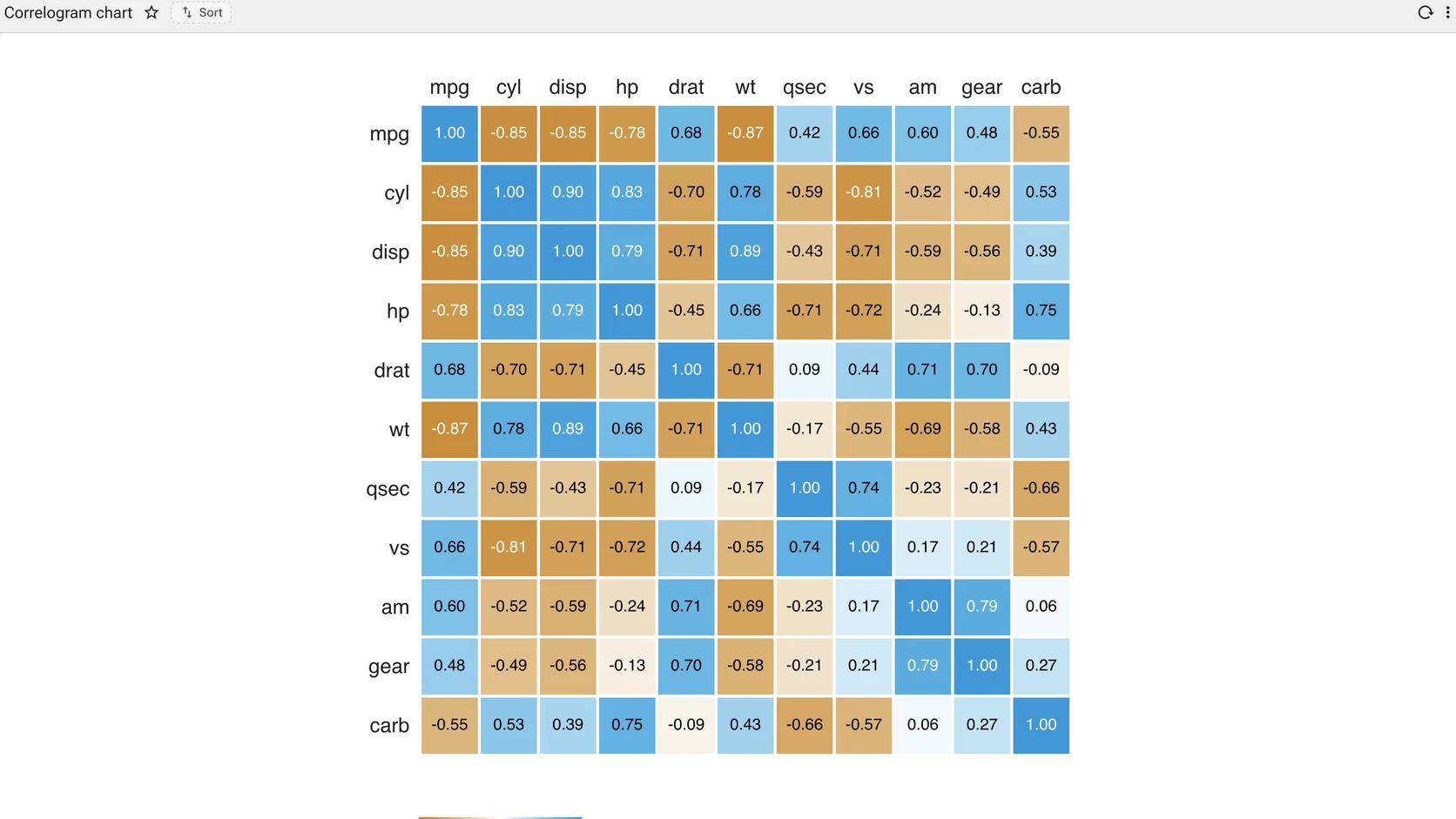
Every variable against every other
Shape, spread and density rather than the average
A correlation matrix where the number and the colour say the same thing twice. Ten variables produce a hundred cells and the eye finds the strong pairs before the reader has parsed one figure.
Correlation · 2
Whether two measures move together. The encoding has to make the absence of a relationship as visible as its presence.
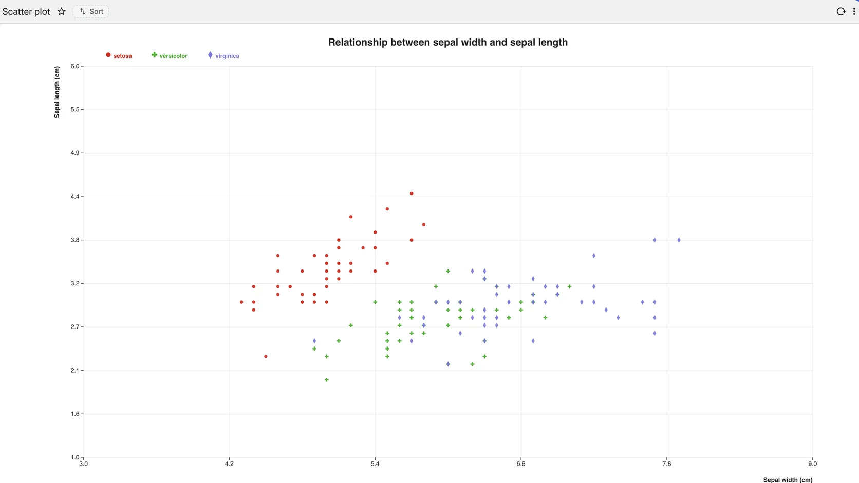
Two measures against each other
One measure against another
Correlation between two numeric columns, coloured by a third. Axis scales, point size and grid are properties on the view.
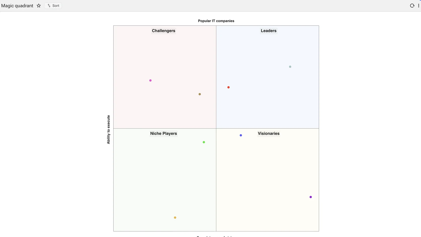
A two-by-two, drawn from data
One measure against another
Two measures, four named quadrants, positioned by the query. The slide a strategy team usually builds by hand in a drawing tool.
Hierarchy · 3
Structure that nests. The choice is between showing the size of the parts and showing the shape of the tree.
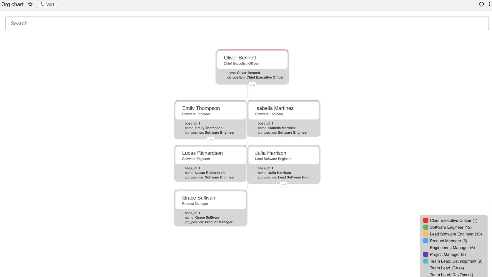
Reporting lines
Structure that nests
Boxes, lines and a legend by role, drawn from a parent key. How many levels open by default is a setting.
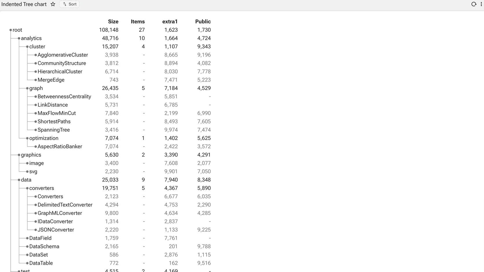
A hierarchy that is also a table
Structure that nests
An outline on the left, measures on the right. For hierarchies where the reader needs the numbers as well as the shape.
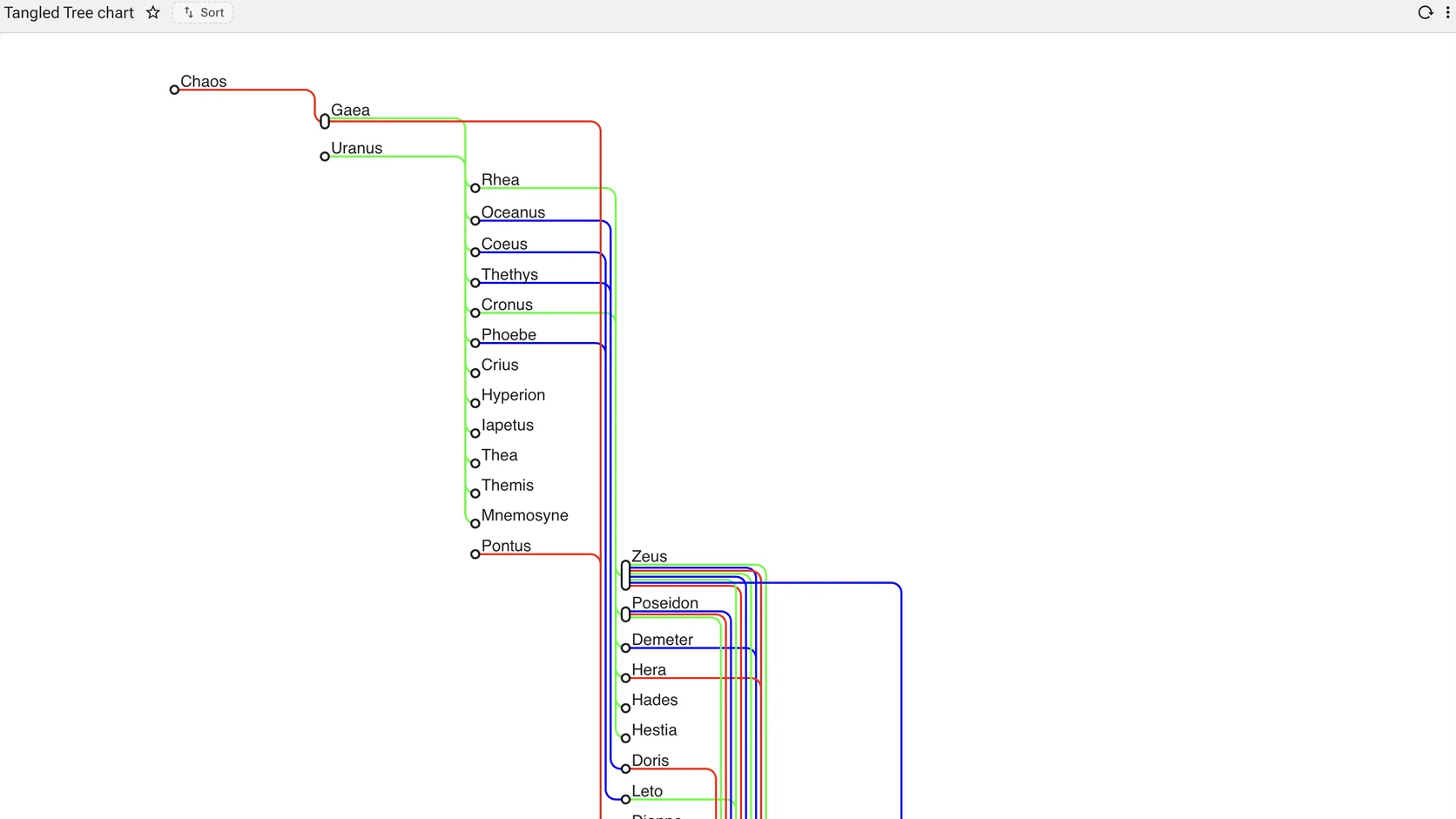
A hierarchy where nodes have several parents
Structure that nests
Most hierarchy charts assume one parent per node. This one does not — the routed, bundled links carry the cases where something belongs to more than one branch.
Flow and network · 3
What moves between what, and what connects to what. The subject is the edges rather than the nodes.
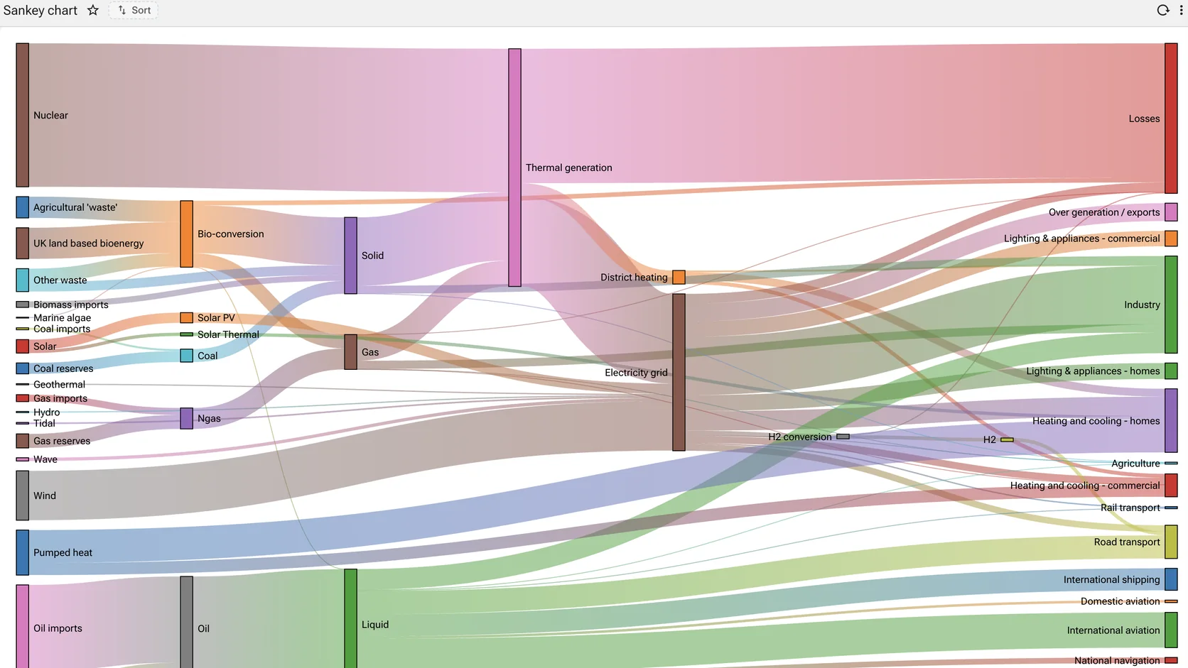
Where quantities go
What connects to what, and what moves between
Sources, conversions, destinations, and the width of every band proportional to what moved through it. Energy, cash, materials, headcount — anything with a flow.
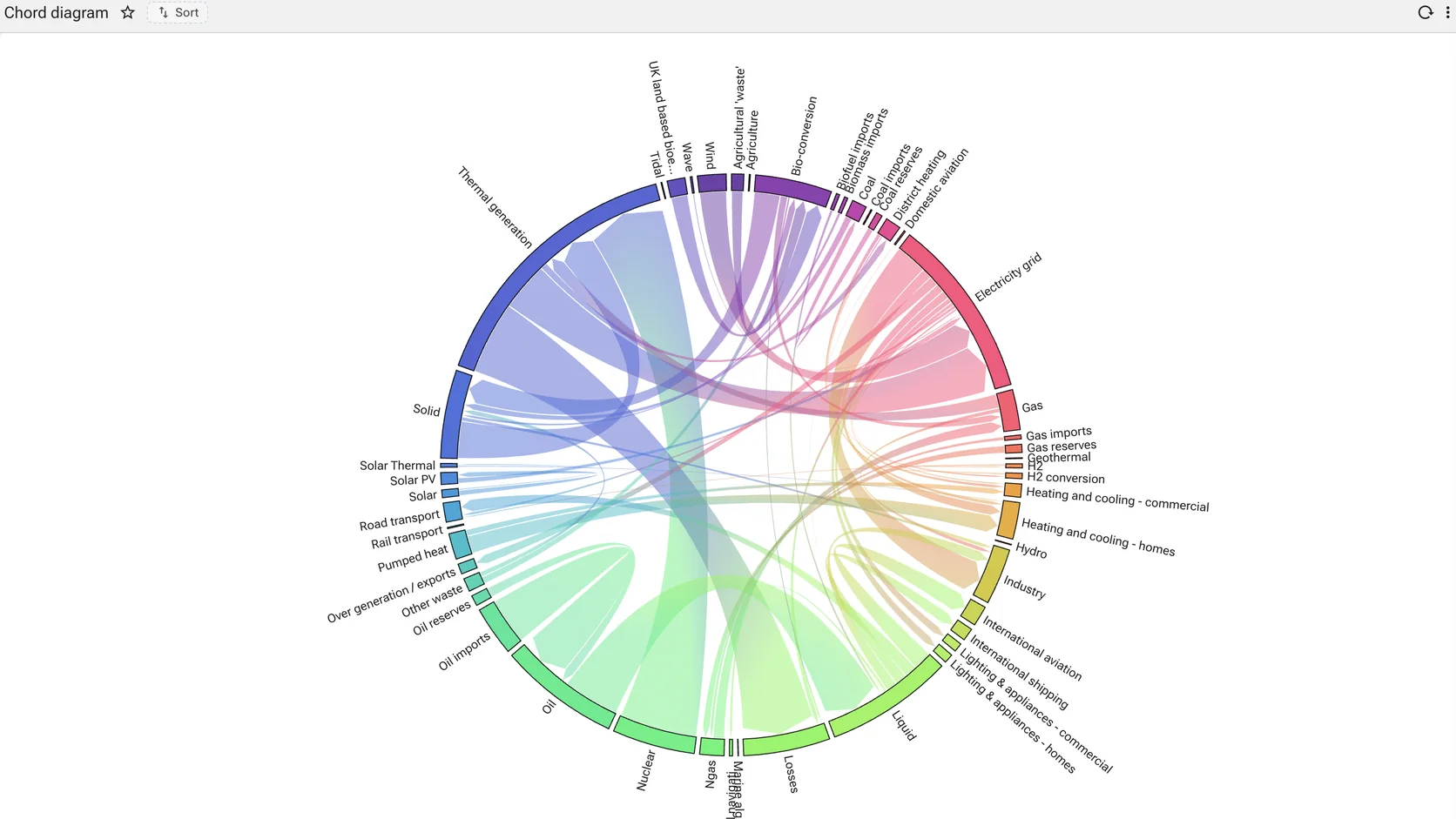
Flow between every pair
What connects to what, and what moves between
Every pair of categories connected by a ribbon whose width is the volume between them. The matrix that would take a hundred rows to read.
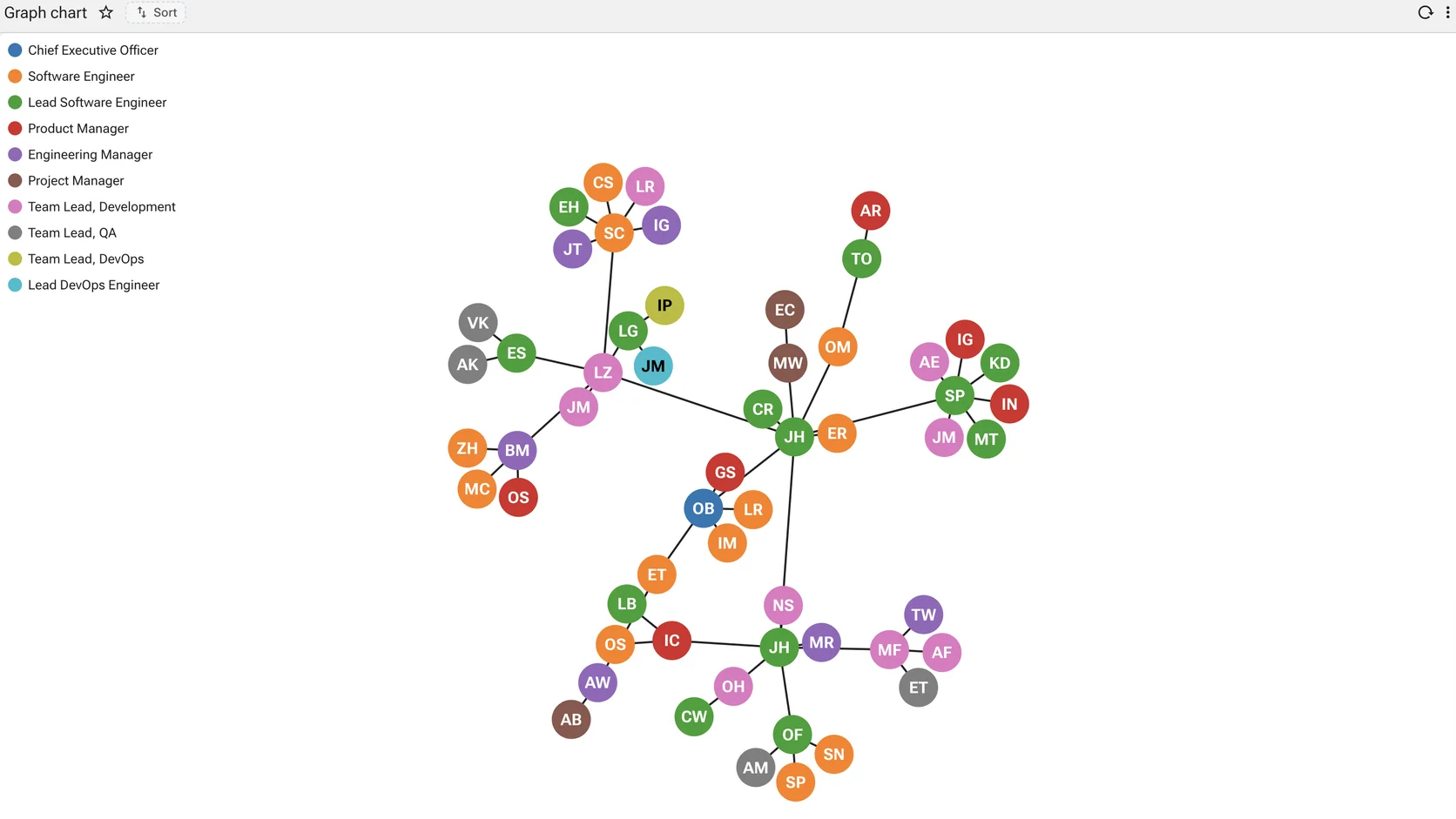
Relationships, not rows
What connects to what, and what moves between
Nodes and edges laid out by force, coloured by whatever the query says they are. For the questions a join answers badly.
Radial · 3
The same encodings wrapped around a centre. Right when the dimension is genuinely cyclical or the comparison is of profiles; decorative otherwise.
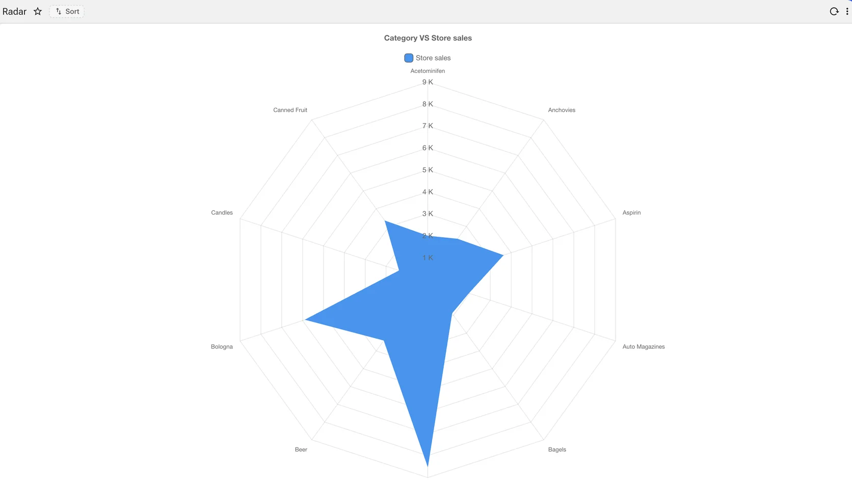
Several measures at once
The same comparisons, wrapped around a centre
Each axis a measure, the shape the profile. Useful where the comparison is between shapes rather than between numbers.
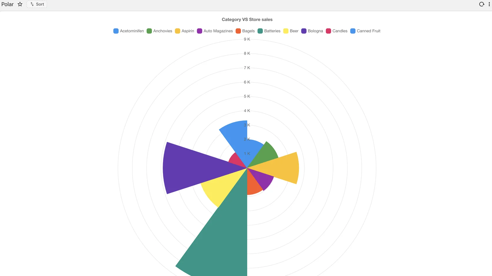
Magnitude around a circle
The same comparisons, wrapped around a centre
Wedge size carries the value. A circular layout for a categorical measure, with the legend naming each segment.
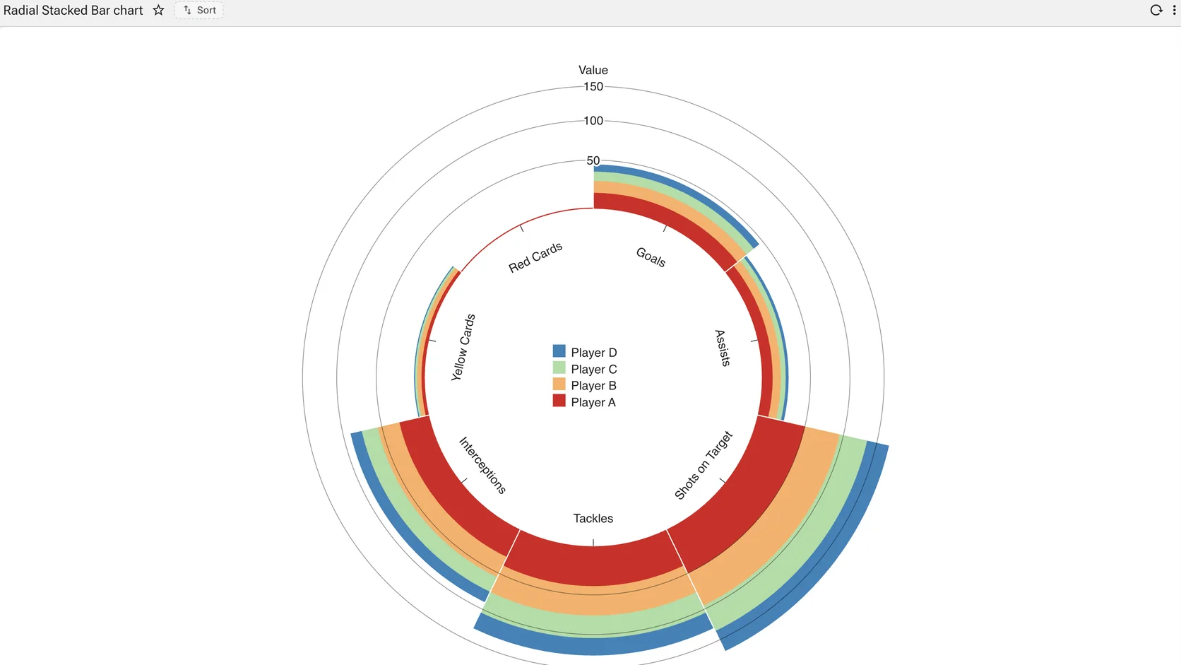
A ranking bent into a circle
The same comparisons, wrapped around a centre
Stacked bars wrapped around a centre, so a long ranked list fits a square frame. The legend sits in the middle where the space would otherwise be wasted.