Every surface an enterprise application needs, declared as metadata.
One palette holds a currency input and a Sankey diagram, signature capture and an SSH terminal, a date picker and a 3D file preview. 114 components in 12 groups, each one a property on a metadata record rather than a screen wired by hand. Open the Application Editor on any running page and the whole catalogue is there, searchable, grouped, and applied by configuration.
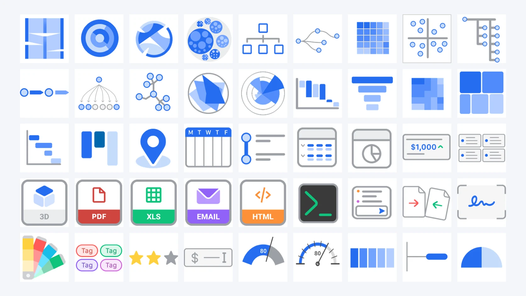
114 components, 12 groups
Form · text inputs · numeric inputs · select inputs · date inputs · special inputs · colour inputs · data views · charts · micro charts · file previews · widgets. The count is not a marketing figure — open the Application Editor on any page and the palette states it.
Same data, six views
A virtual table renders the same source as Grid · Grid Transposed · List · Timeline · Analytical Card · Calendar — view-type is a property, not a separate component. The buyer who wants their data as a calendar gets a calendar; the buyer who wants it as a timeline gets a timeline; the metadata entry is unchanged.
Inline analytics in grid rows
Grid columns can render as line, area, vbar, percent, progress, ball, distribution, pie, battery, rate, gauge or circle visualisations — mini-charts inside individual cells. The kind of analytical grid that takes weeks to build by hand, configured as a column property.
The render system for every data type
Numeric → readable (units, currency, bytes, time, duration), spinner, slider, rating, percentage. Date → date, time, datetime with precision and condition wiring. Select → select, choice, item-group with their full styling catalogue. Each data type carries its own render variants.
Two grid modes — backend-paginated and in-memory
The enterprise data grid runs in two modes. Backend-paginated for scrollable result sets at million-row scale: data fetched server-side, virtual-scrolled client-side, no DOM explosion. In-memory for analytical workloads: full dataset loaded once, with client-side filtering, grouping, sorting and inline analytical visualisations. One widget, two scale regimes.
The catalogue, component by component
Every component in the Application Editor palette, in the groups the editor itself uses. The icons are the editor’s own.
Form3
The containers that turn a metadata record into a working screen.
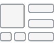 Input fieldsThe field block a user types into.
 Query fieldsThe block they search with.
 ActionThe button that does something.
Text inputs7
Seven text controls, each with its own validation and keyboard behaviour.
 TextFree text, single or multi-line.
 PasswordMasked entry with strength feedback.
 EmailFormat-validated address.
 TelephoneCarries its dialling prefix.
 SMSMessage field bound to a send action.
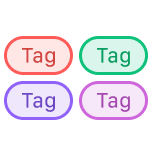 TagsMultiple labels in one field, coloured.
 HotkeyBinds a keystroke to an action.
Numeric inputs10
Ten numeric controls that understand what the number means.
 NumericPlain number with scale and precision.
 SpinnerStep up and down within bounds.
 PercentRendered and stored as a proportion.
 CurrencyFormats to the reader's currency.
 DurationElapsed time, not a clock face.
 TimeTime of day as a numeric value.
 UnitsValue plus unit of measure.
 BytesScales to KB, MB, GB for the reader.
 SliderDrag within a range.
 RatingStars or custom icons, half steps.
Select inputs7
One bound value, seven controls — chosen by what fits the workflow.
 SelectDropdown, single value.
 ChoiceRadio group, all options visible.
 Check boxBoolean, or multi-select set.
 SwitchBoolean as an on/off state.
 Item groupChips with icons and colours.
 StepperOrdered stages through a process.
 Button groupSegmented control.
Date inputs3
Date, time and timestamp with precision control and conditional wiring.
 DateCalendar picker with precision.
 TimeTime picker, configurable granularity.
 TimestampDate and time as one value.
Special inputs4
The four a business application needs and usually has to glue together.
 FileUpload with progress and preview.
 ImageUpload, crop and preview in place.
 SignatureApproval evidenced, not asserted.
 Range sliderTwo handles, an interval.
Colour inputs2
Colour as a first-class data type.
 PickerFull colour wheel and channels.
 PaletteConstrained to a defined set.
Data views17
Seventeen presentations of one dataset. The view type is a property.
 TableThe default tabular grid.
 ReportGrouped, totalled, print-ready.
 Analytical gridMicro-charts inside the cells.
 Grid transposedRows become columns for comparison.
 ListStacked records with images and badges.
 ChecklistRecords as completable items.
 KanbanCards in status columns.
 CalendarRecords placed on a month or week.
 GanttDurations and dependencies on a timeline.
 TimelineChronological, with icon and colour.
 TreeParent-child hierarchy.
 Tree gridHierarchy with columns.
 Map (geographic)Records positioned geographically.
- Map (schematic, SVG)Your own drawing, regions coloured from the query.
 CardsOne card per record.
 Analytical cardKPI tile with an embedded chart.
 HTMLFree-form rendered markup.
Charts32
Thirty-two chart types, engine-rendered from the same metadata.
 Vertical barMagnitude by category.
 Vertical bar stackedComposition within each bar.
 Horizontal barLong category labels.
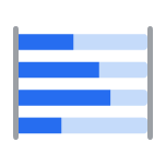 Horizontal bar stackedComposition, read across.
 LineChange over a continuous axis.
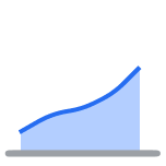 AreaVolume under a trend.
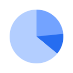 PieShare of a whole.
 Half pieShare, in a shallow band.
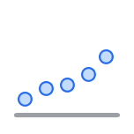 DotValue without implied continuity.
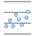 Scatter plotTwo measures, one point per record.
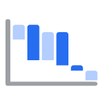 WaterfallHow a total was arrived at.
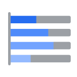 BatteryProgress toward a target.
 FunnelDrop-off between stages.
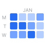 CalendarDaily density across years.
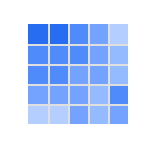 CorrelogramCorrelation across many measures.
 HeatmapIntensity across two dimensions.
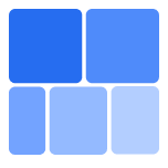 TreemapHierarchy sized by value.
 SankeyA quantity through every stage that changes it.
 SunburstHierarchy read from the centre out.
 RadarSeveral measures on one shape.
 Polar areaMagnitude around a circle.
 Radial stacked barStacked composition, radially.
 ChordFlow between every pair.
 Circle packingNested hierarchy, sized.
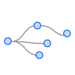 DendrogramBranching structure.
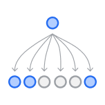 Flow chartSteps and decisions.
 GraphNodes and their connections.
 Process flowA business process and its decision points.
 Indented treeHierarchy as an indented list.
 Tangled treeHierarchy with cross-links.
 Org chartReporting lines, expandable.
 Magic quadrantPosition against two axes.
Micro charts15
A complete visualisation inside a single grid cell.
 BarBars in a cell.
 LineTrend in a cell.
 AreaFilled trend in a cell.
 PieShare in a cell.
 DistributionWhere this row sits in the set.
 BatteryLevel against capacity.
 ProgressCompletion as a bar.
 Double percentTwo proportions, one cell.
 CircleProportion as a ring.
 DialValue on a scale.
 GaugeValue against thresholds.
 BallStatus at a glance.
 RatingScore as icons.
 Min maxRange with the current value.
 Min/max rangeAn interval within a range.
File previews9
The attachment renders in place — nothing leaves the perimeter.
 PDFPaged document, in the form.
 ImagePicture with zoom.
 VideoPlayback inline.
 AudioWaveform and transport.
 HTMLRendered markup.
 TextPlain text with wrapping.
 ExcelSpreadsheet, cells and formulas.
 EmailMessage with headers and parts.
 3DModel with orbit and zoom.
Widgets3
Operational tooling in the same palette as a currency field.
 DiffTwo versions, differences marked.
 ChatConversation bound to a record.
 SSH terminalA shell inside the application.
The two grid modes — same widget, two scale regimes
The enterprise data grid runs in two modes that share the same widget, the same column definitions, the same render system, and the same wiring. The difference is where the data lives.
Backend-paginated mode handles scrollable result sets at million-row scale. The platform fetches one page server-side, the grid virtual-scrolls client-side. The user perceives an infinite scroll; the network sees a series of small page-fetch requests; the browser DOM never explodes. The grid filters, sorts and groups by issuing the right query against the backend; the database does the work it is good at.
In-memory mode handles analytical workloads. The full dataset is loaded once; subsequent filtering, grouping, sorting, aggregation and inline analytical visualisations all happen client-side, without further network round-trips. The grid behaves like an in-browser analytical engine — fast feedback loops, no server pressure for every interaction. The same column metadata drives the analytical visualisations (line, percent, gauge, battery, etc.) that turn a row of numbers into a row of charts.
The buyer chooses the mode by the workload, not by the widget. The application surface is the same.
What this page is, and what it is not
This is a catalogue, and a catalogue invites a reading the platform has to refuse: that what is on offer is a component library. It is not. A library hands a developer a set of parts and leaves the wiring, the security, the audit trail and the persistence to them. Nothing on this page is wired by hand. Each entry is a property on a metadata record — the component is chosen, bound to a column or a dataset, and rendered by the runtime with row- and column-level security already injected.
Which is why the count is worth stating plainly rather than rounding up. 114 is what the editor prints, in the twelve groups the editor uses, and any consultant with the palette open can check it. The number matters less than its span: a currency field and a Sankey diagram, signature capture and an SSH terminal, a date picker and a 3D preview, drawn from the same repository and governed by the same perimeter.
The working reference is the palette itself, not this page — it is in front of every consultant authoring an application on the platform. The full demo catalogue is a running application, available on request.